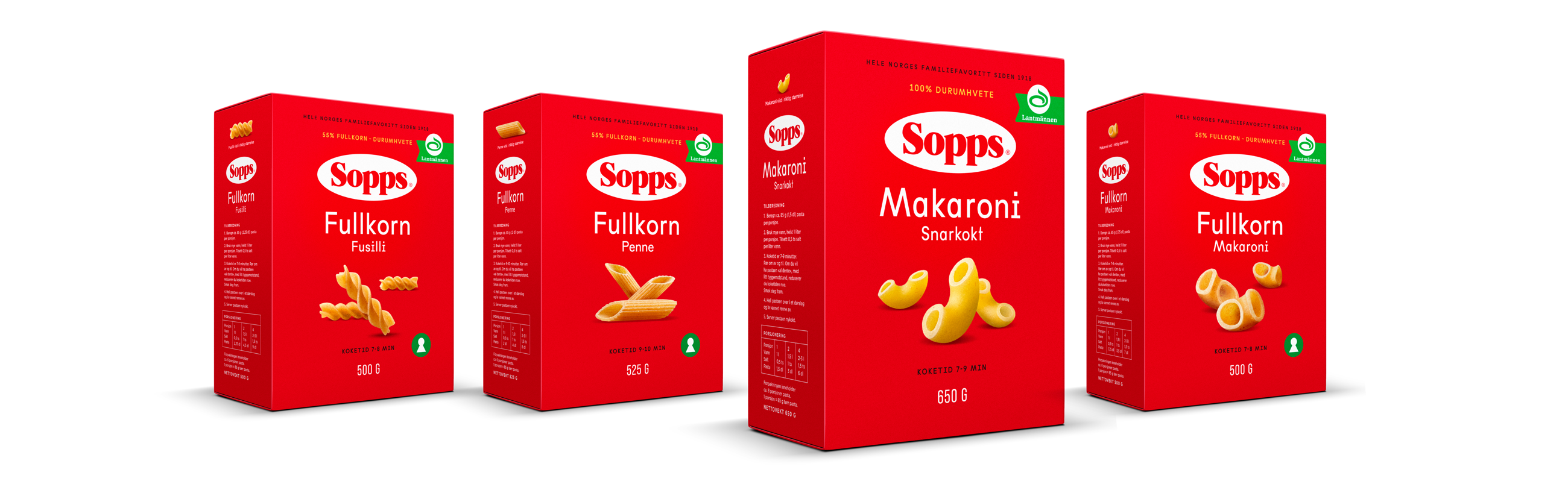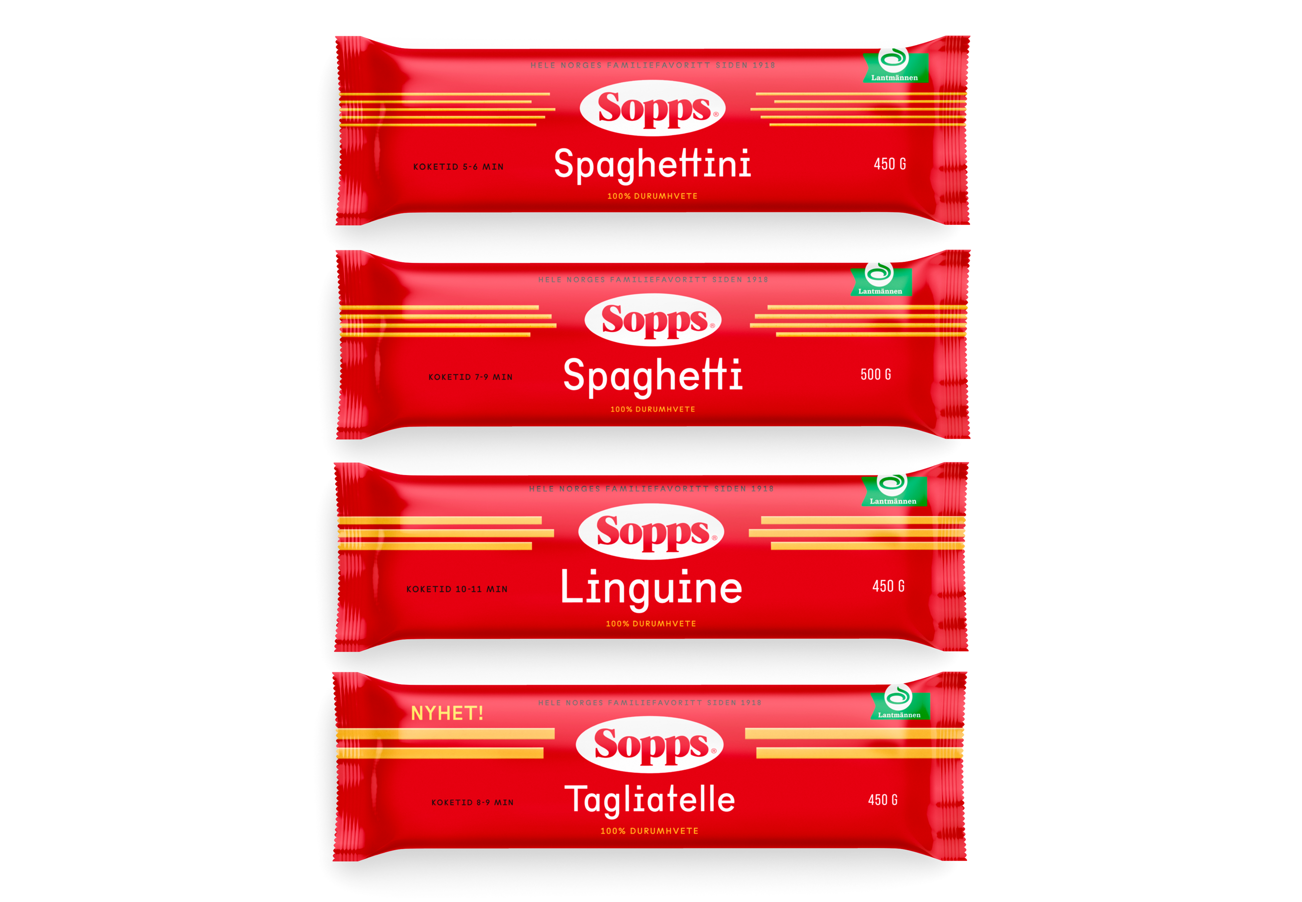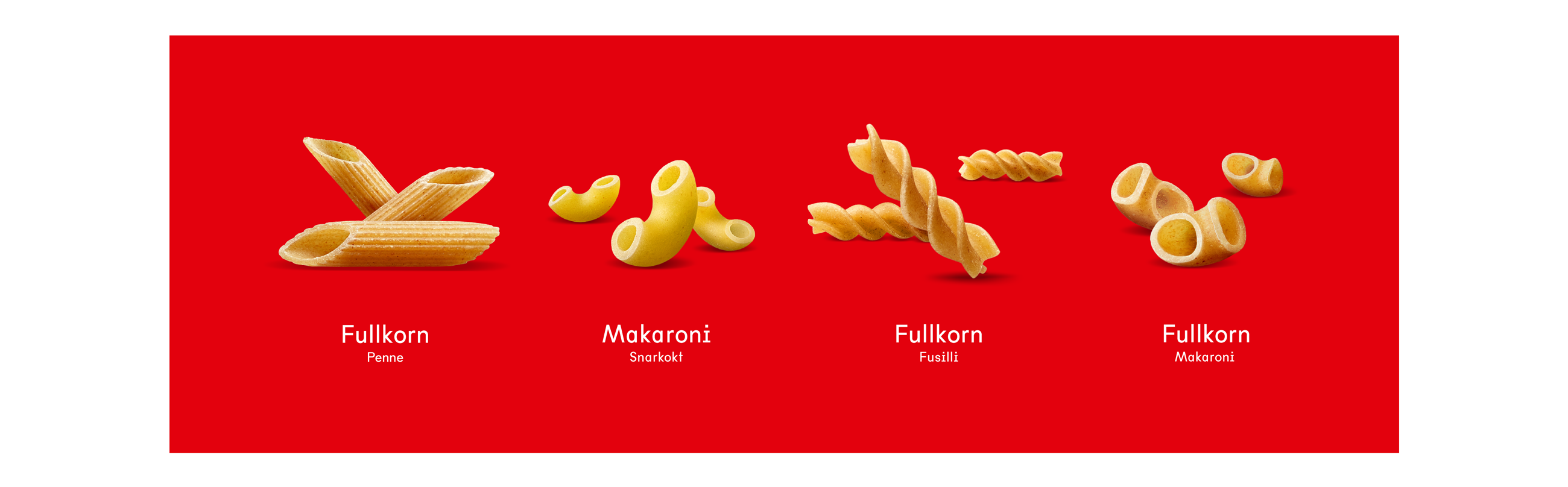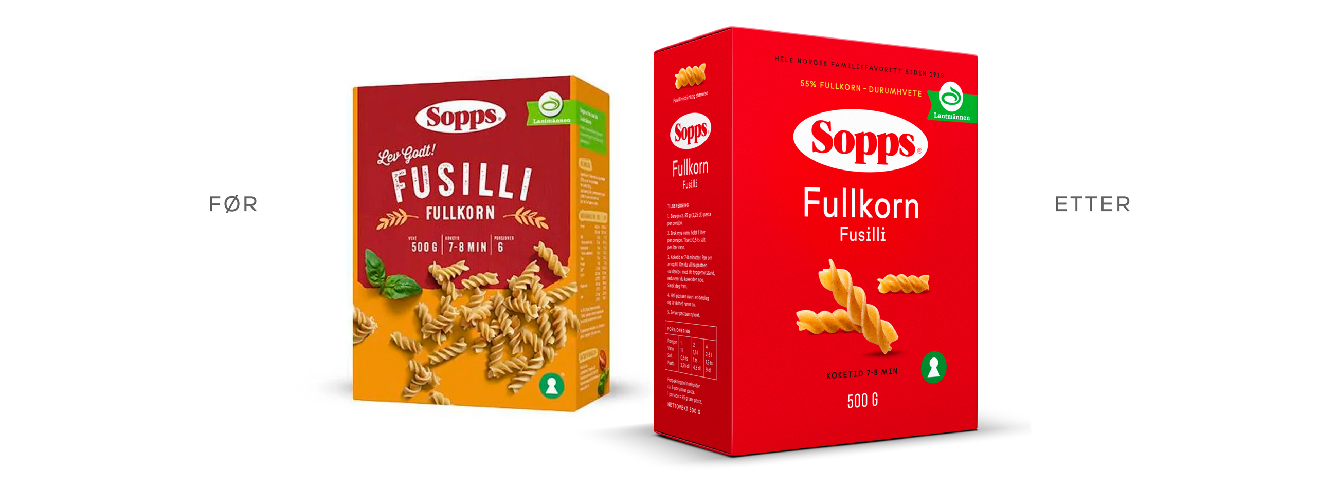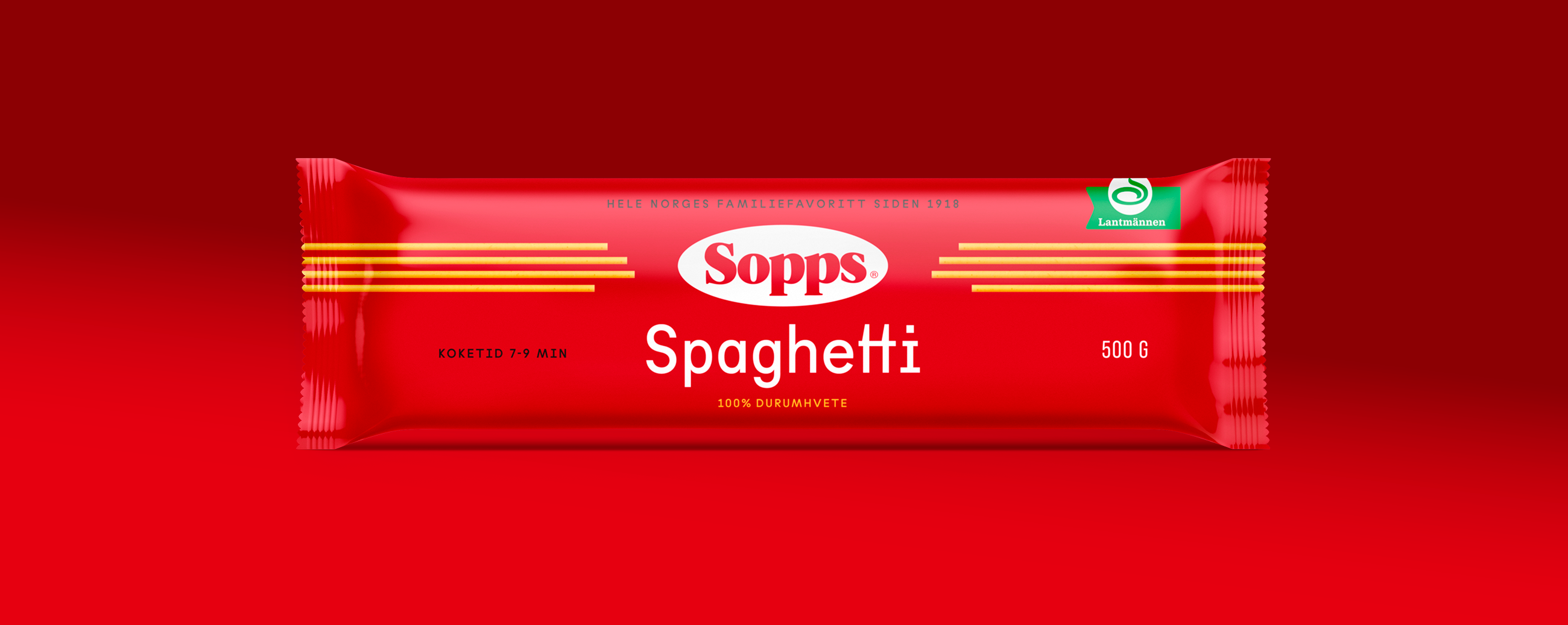
At Strømme Throndsen Design, we have developed the new packaging design for Sopps with the goal of creating a modern and appealing expression that enhances shelf impact and ensures optimal visibility in stores. By combining iconic product imagery that clearly visualizes the contents, the red background, and the well-known logo, we have created a design with high memorability that increases the perceived value of the products. The redesign has a distinct stopping power that captures the customer's attention and builds trust in the product.
With a consumer-focused approach, we have ensured that the design is both functional and inspiring. Key information such as cooking time, weight, and ingredients is clearly presented, making product selection easy. We have balanced tradition and innovation, developing a solution that serves as a strong category enhancer in a competitive market.
Sopps now has an expression we call "premium everyday" – a visual upgrade of the brand that signals quality while remaining familiar and accessible to consumers. Through visual storytelling, we have created a holistic experience that preserves Sopps’ tradition while appealing to modern customers. The redesign is a clear example of how aesthetics and functionality can merge to create stronger brands and more attractive products on store shelves.