On entering their modest production facility in 2002 we quickly noticed the potential for growth. We saw the majestic archipelago of Norway ́s Lofoten islands as the perfect backdrop to create an interesting brand expression and to tell a compelling story.
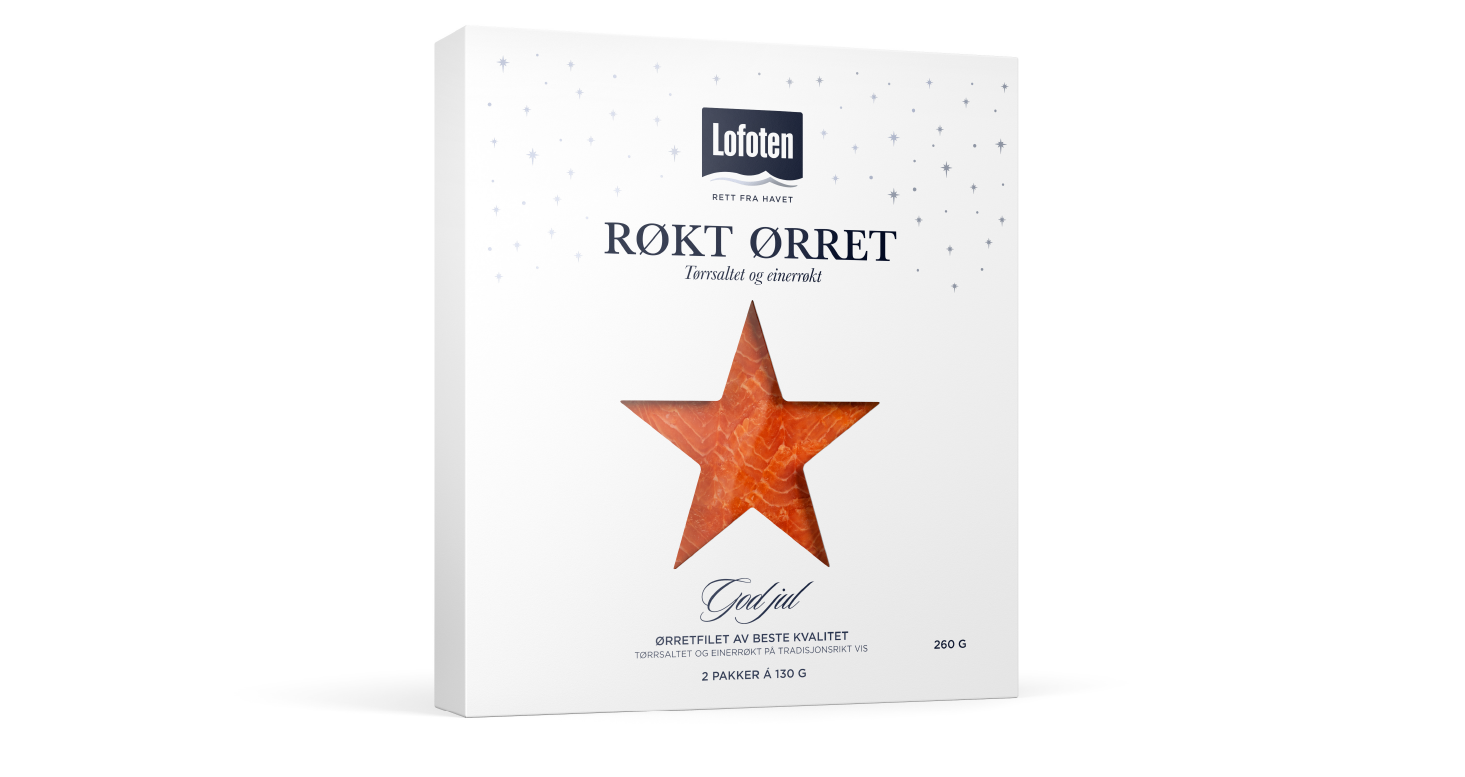

LOGOTYPE – HAND DRAWN TYPOGRAPHY
We developed and designed the brand “Lofoten" as a way to proudly take ownership of and promote this great region. This went on to win numerous awards and prizes, among them The Grand Prix effect award from the Norwegian Design Council, leaving the Lofoten brand in good hands and in a great position for future growth.
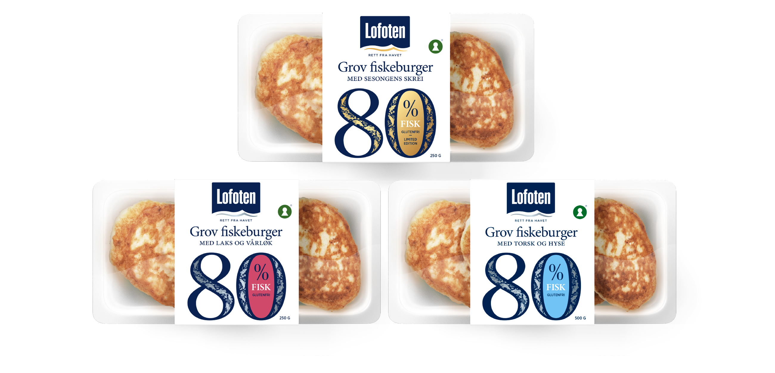

LOGOTYPE – HAND DRAWN TYPOGRAPHY


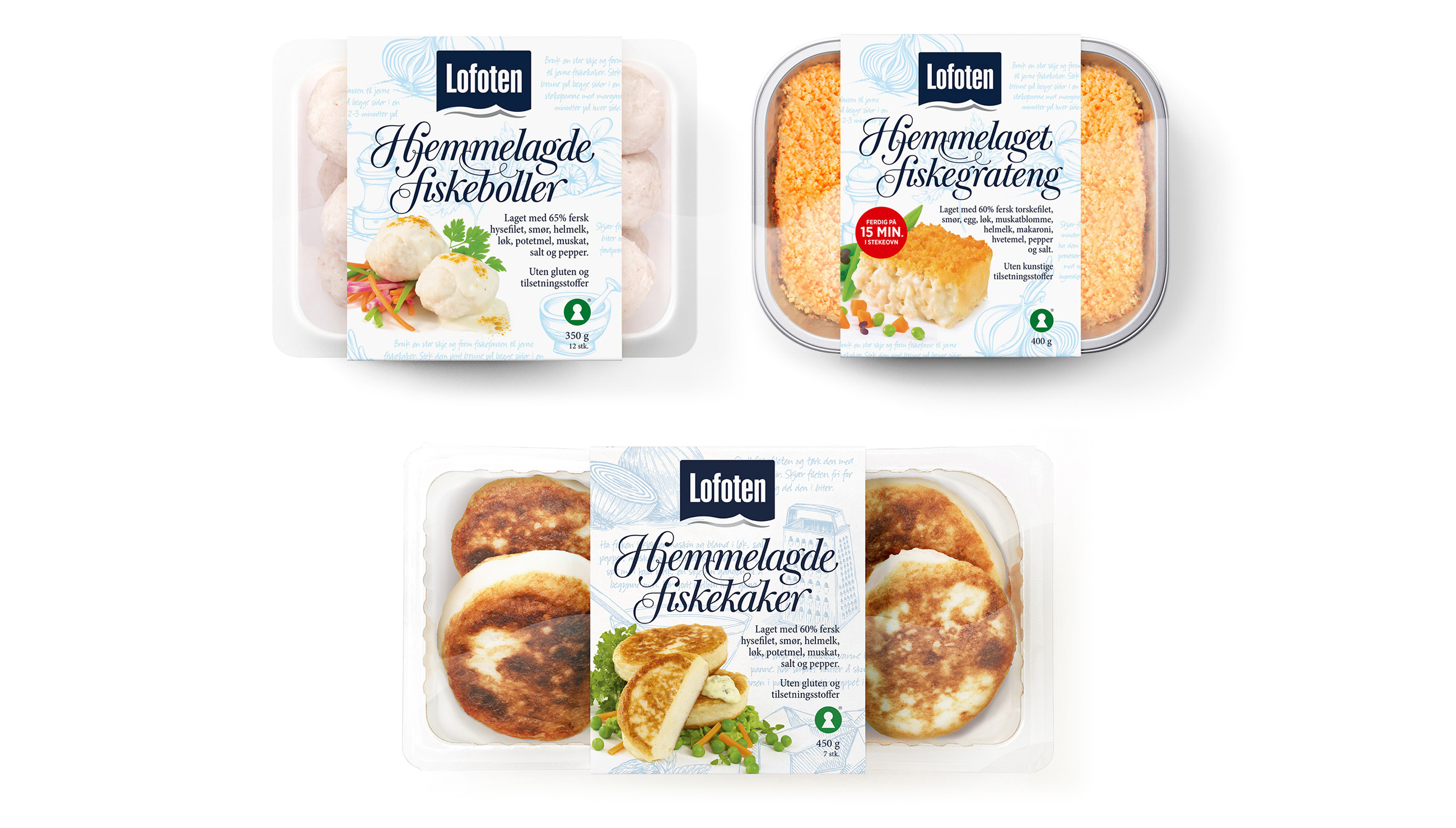
LOGOTYPE – HAND DRAWN TYPOGRAPHY
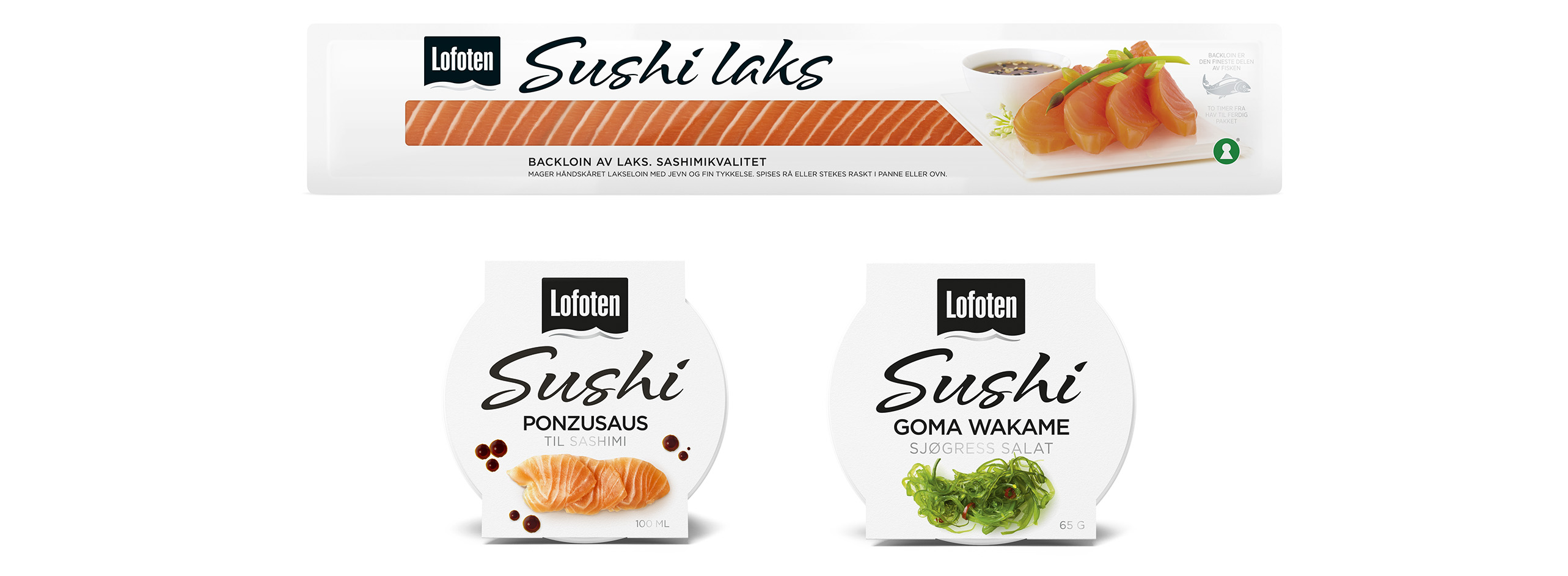

The ranges are linked by a contemporary use of white space and retain the traditional high quality associated with the Lofoten brand.

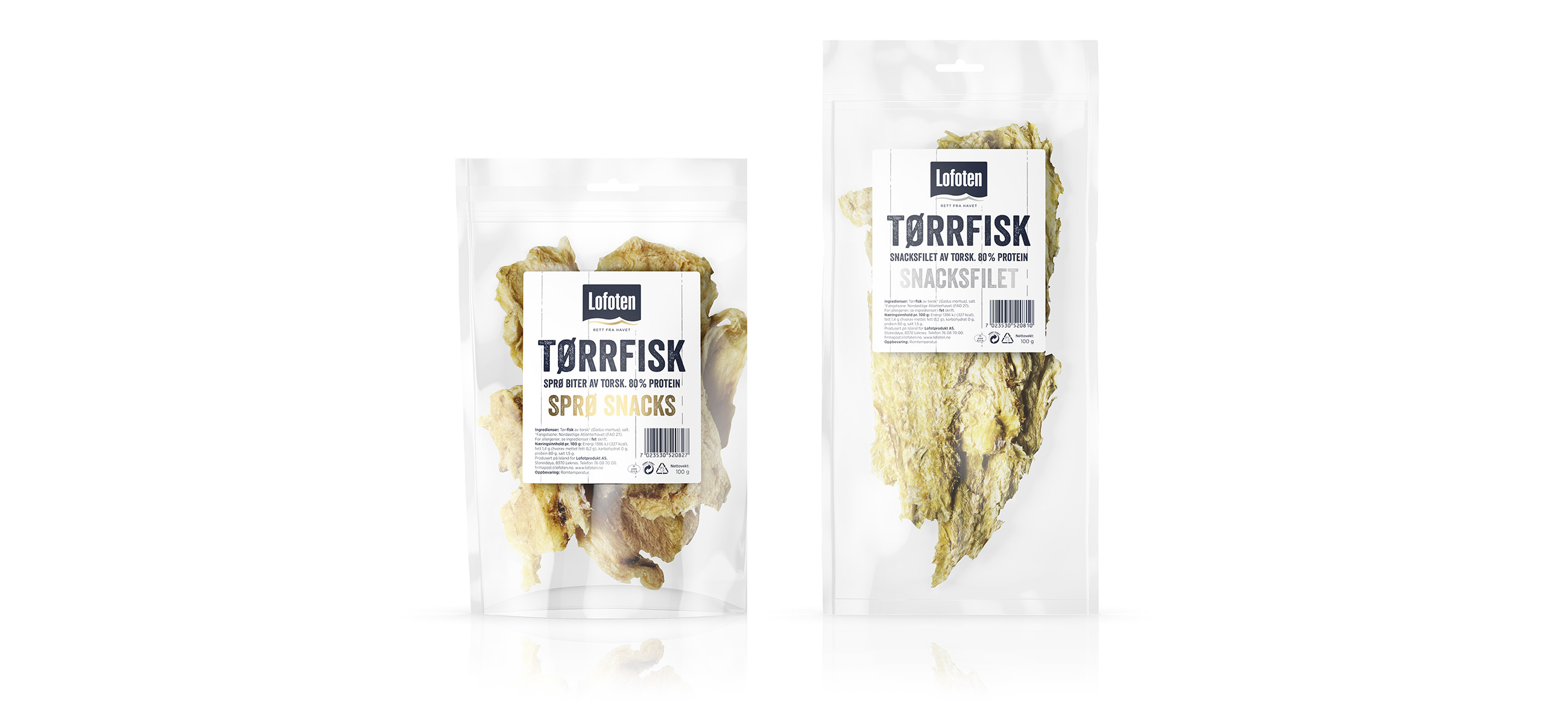
INSULA accumulates and develops interdisciplinary expertise in the processing and selling of seafood, with the intention of becoming a pioneer within the FMCG sector, and has built a portfolio of strong and traditional companies with a particular focus on the Nordic region.

logotype – hand dawn typography