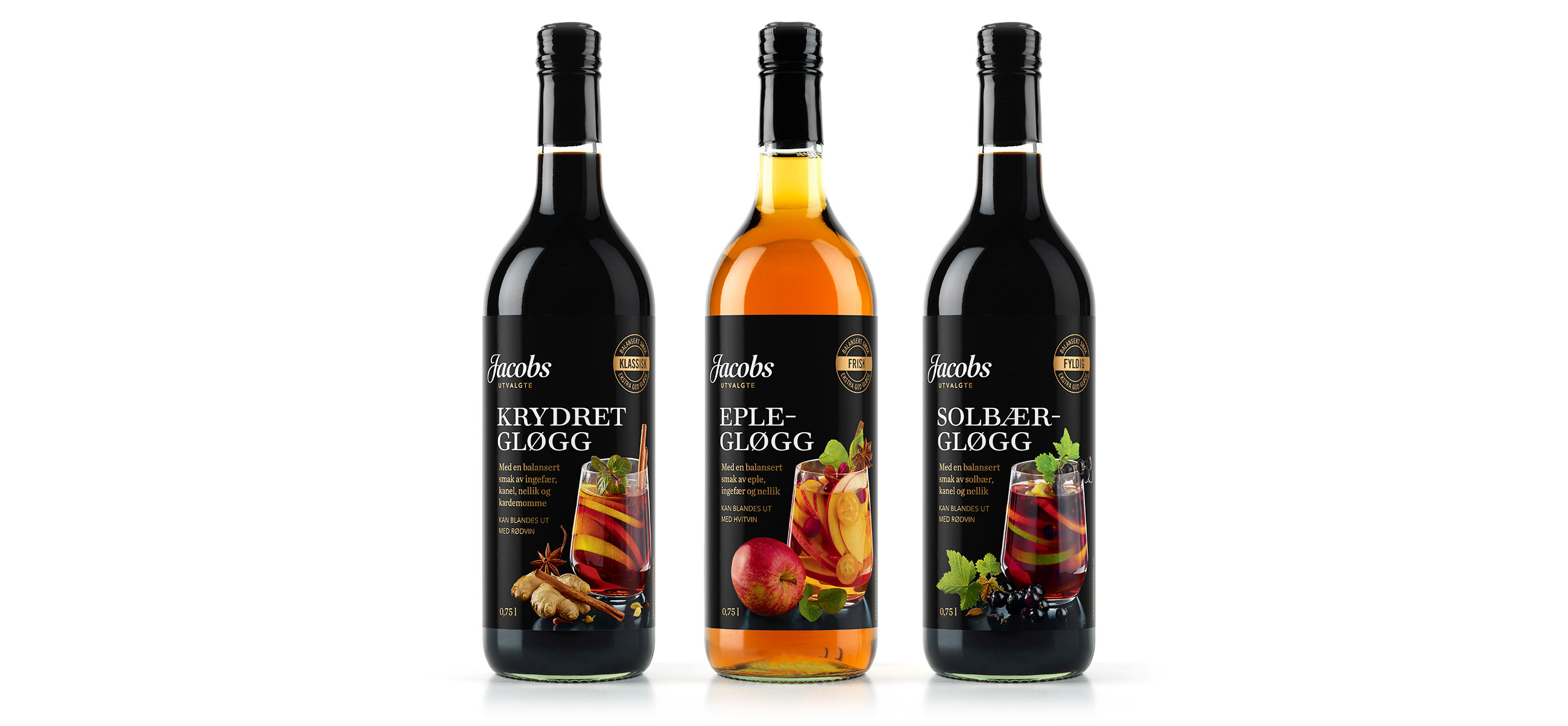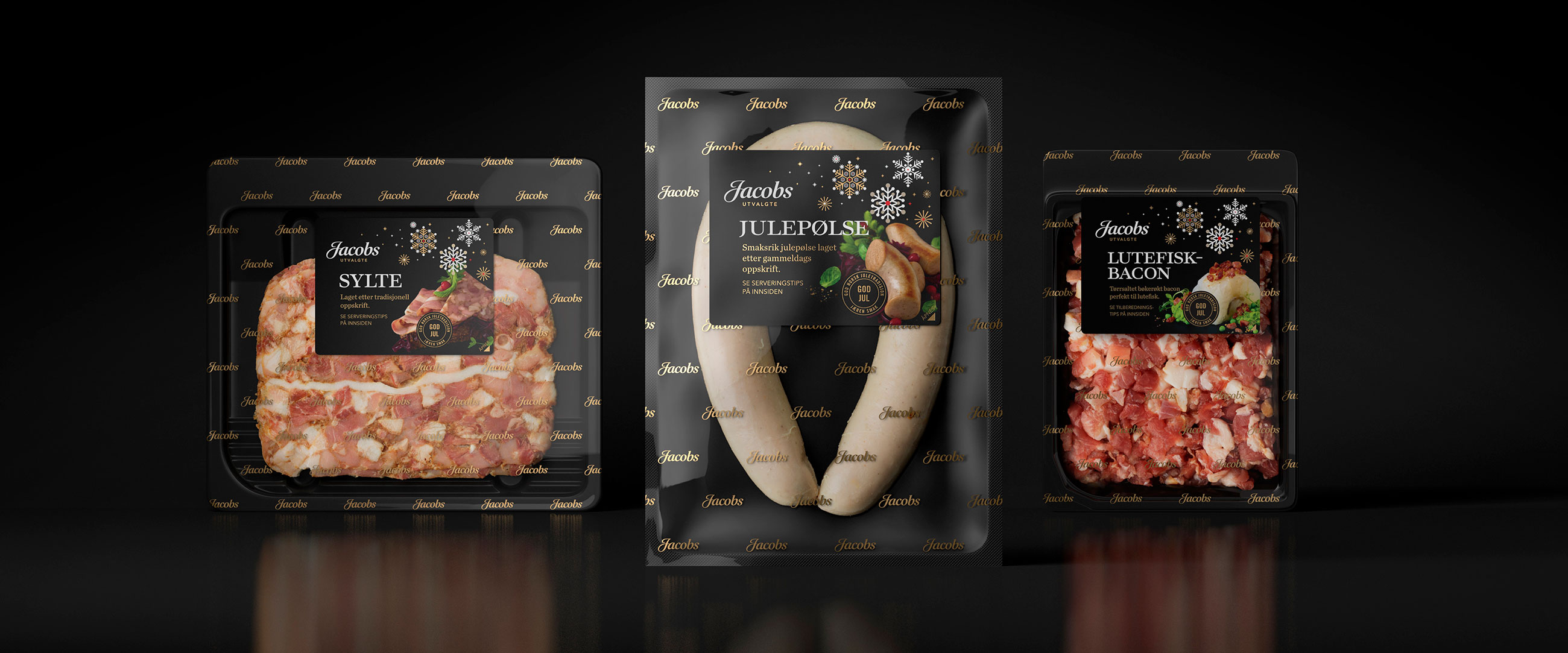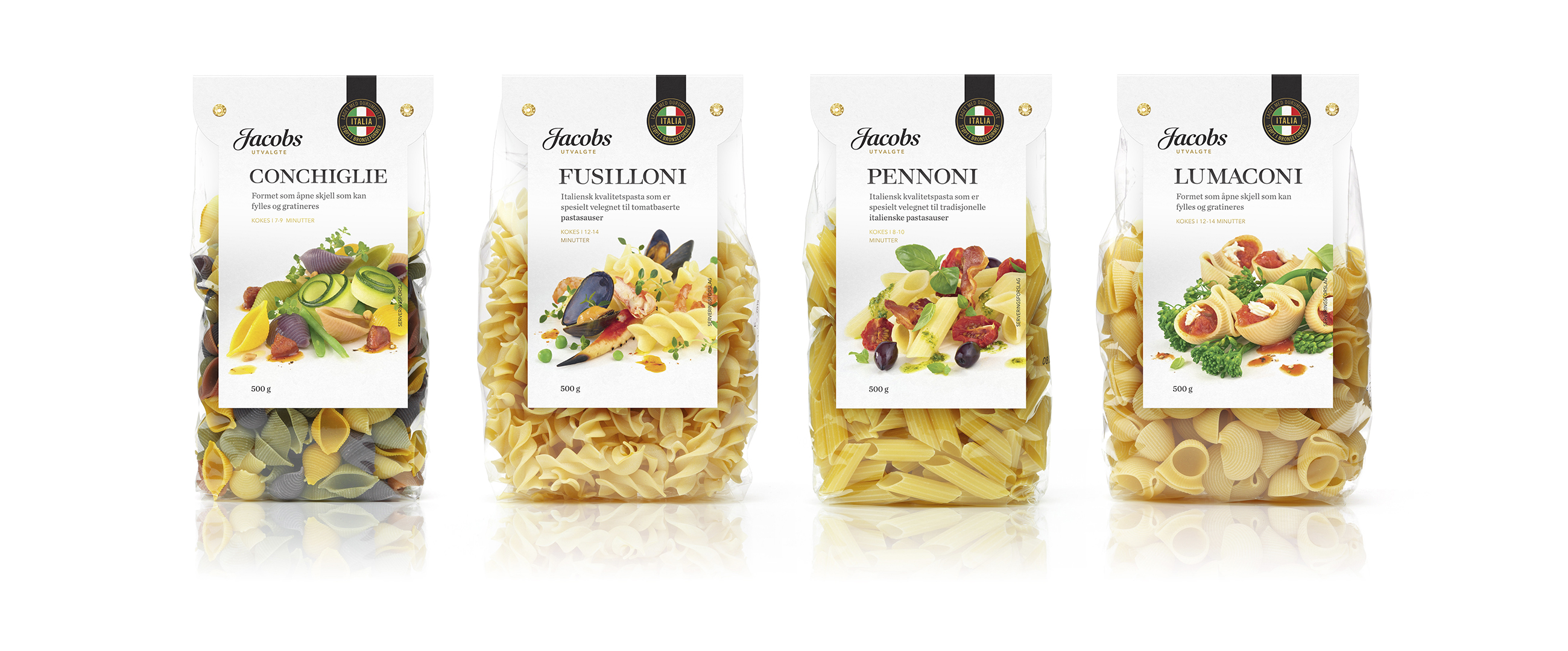

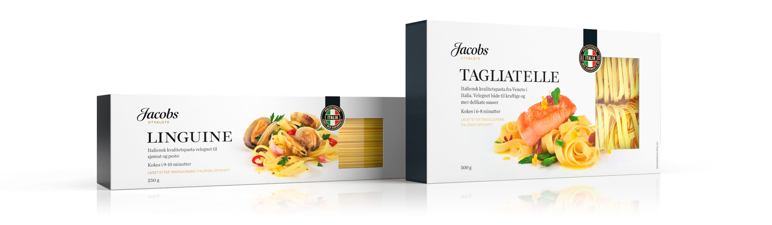
Jacobs Utvalgte is a premium own-brand range from Norgesgruppen selected by professionals with passion for good quality ingredients, flavour, heritage and provenance.
We were commissioned by Norgesgruppen to help establish the label through the creation of the name and a strong visual identity and packaging solution that would deliver shelf impact across all its categories.
LOGOTYPE – HAND DRAWN TYPOGRAPHY
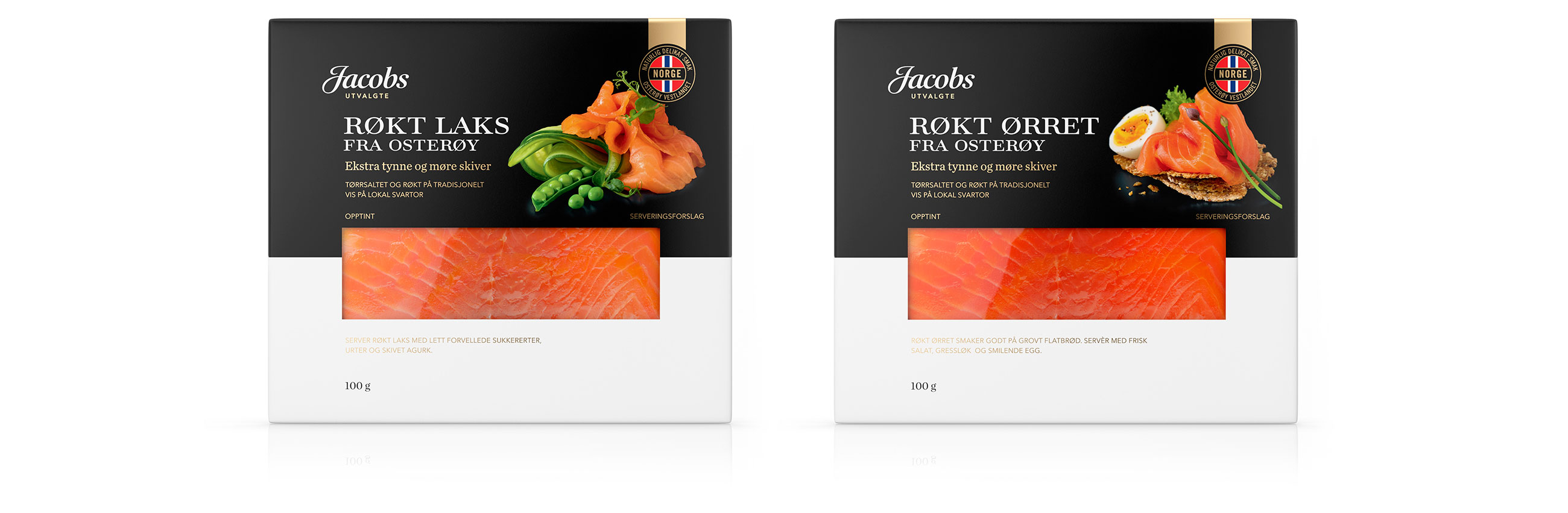
We used distinctive and compelling product photography in combination with a sophisticated black band and gold foil elements. The contrast of hand drawn script and sans-serif gives the design solution a characteristic sense of contemporary craft and quality.
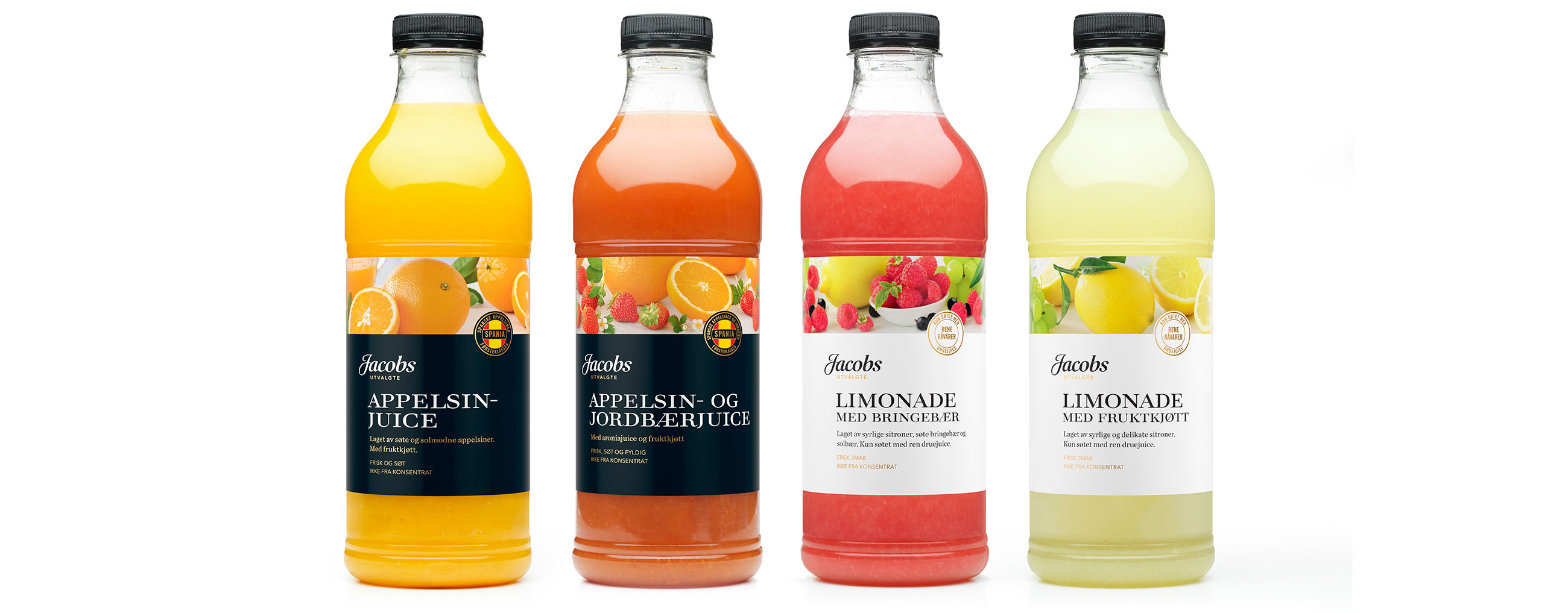
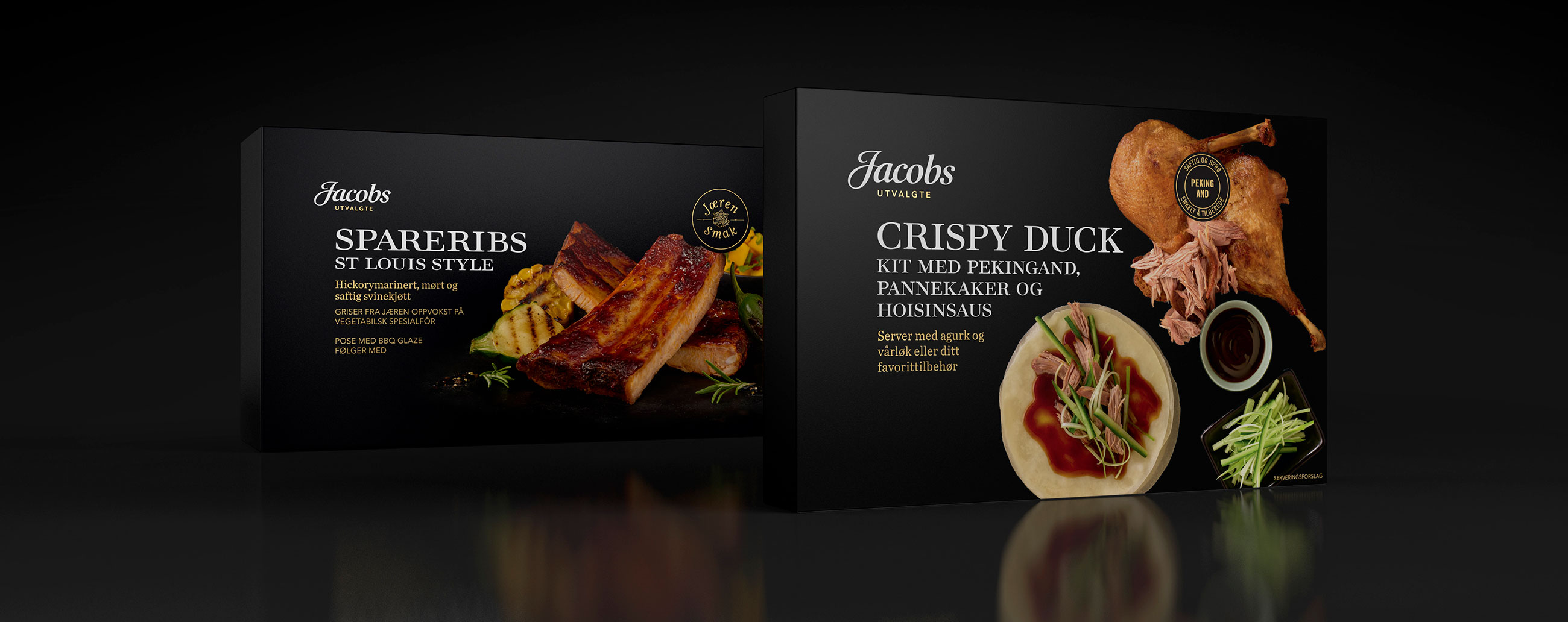
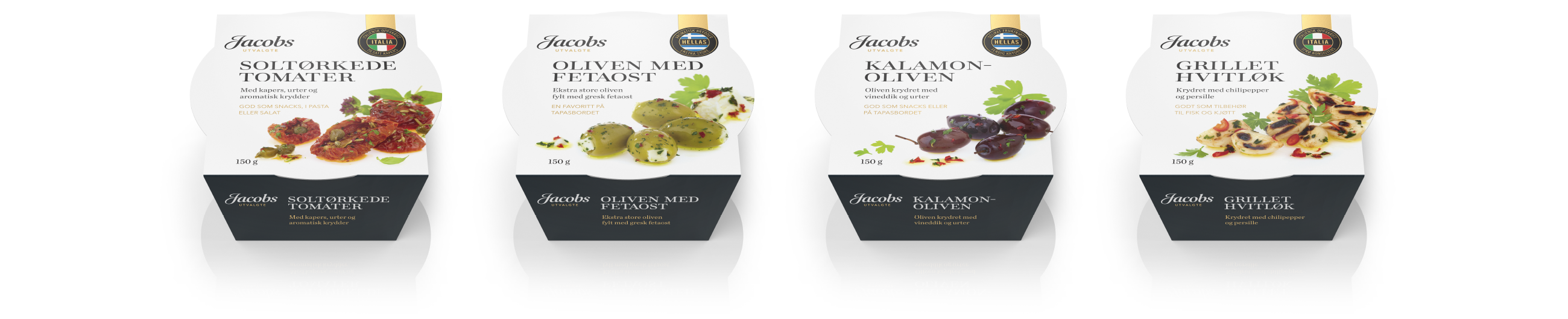

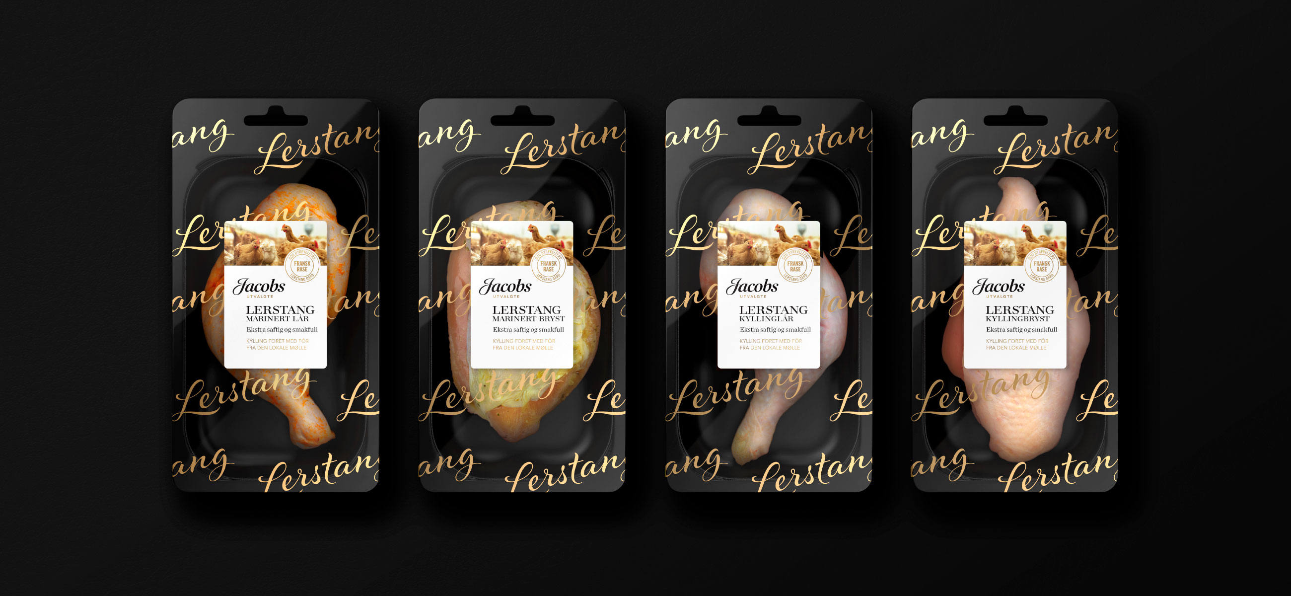
We kept in mind that Jacobs was a premium brand aimed at the discerning consumer when developing the logo for Norgesgruppen’s own brand products. It needed to have an understated quality that projected confidence with a quiet manner, a feel that confirmed the brand message of heritage and provenance. The final logo works well with all of the elements of pack design across a wide range of product areas.
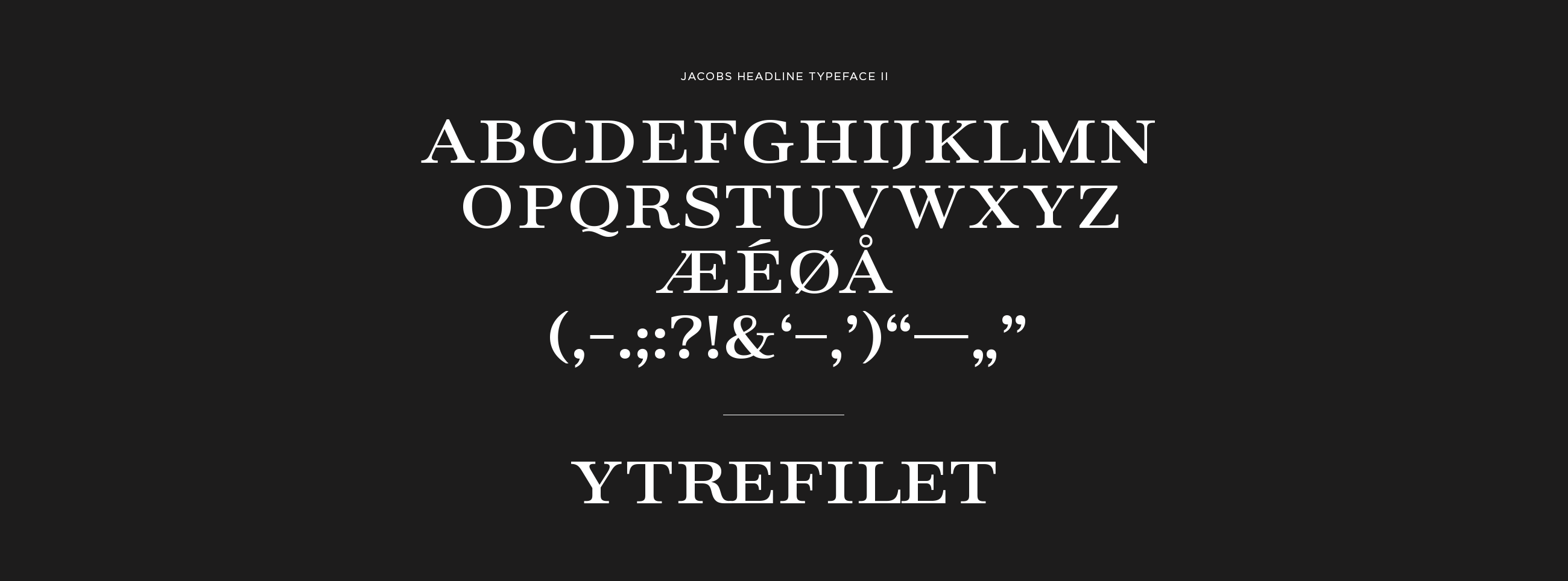
The typeface for the brand grew out of a limited character set for a solution on one piece of packaging. It has a strong modern feel with clean elegant lines and high contrast that compliments the other elements on the label and reinforces the key brand properties.
The secondary version was developed to solve a technical issue with the thin elements of the character structure when printing the type in white out of a black background.
JACOBS HEADLINE TYPEFACE I