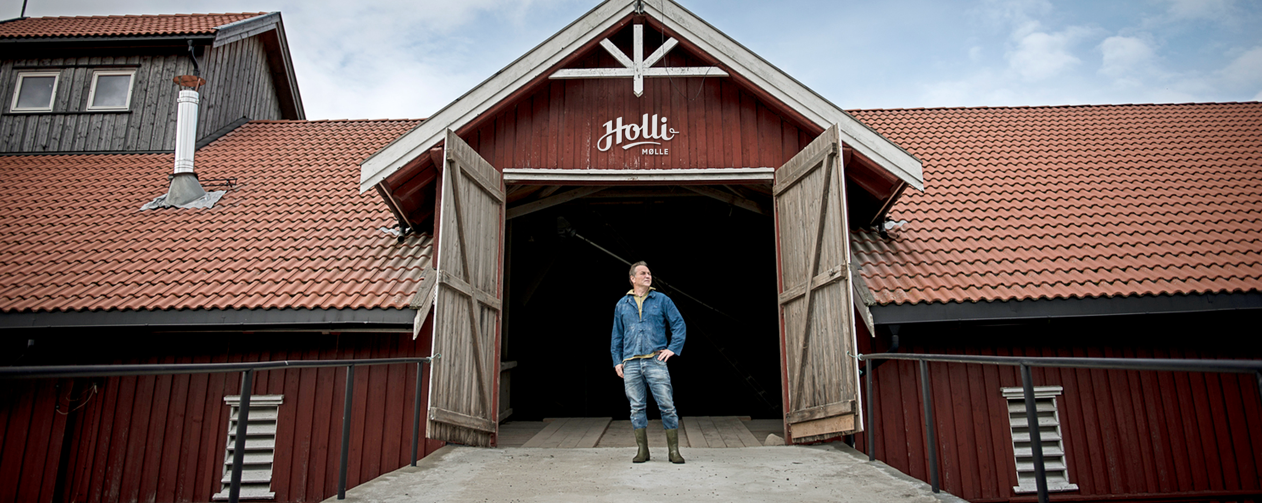


A decade ago Holli Mølle launched their first range of organic flour products, providing Norwegian grocery stores, restaurants and bakeries with a new and diverse selection of locally produced flours. Many of their products come from ancient grains like spelt and emmer and can be traced 5000 to 10000 years back in history. Ten years later, the Nordic market has evolved and Holli Mølle has expanded their assortment to include a number of sub-categories and new product lines. Their position required an updated approach to both Holli Mølle’s brand identity and packaging design.


LOGOTYPE – HAND DRAWN TYPOGRAPHY
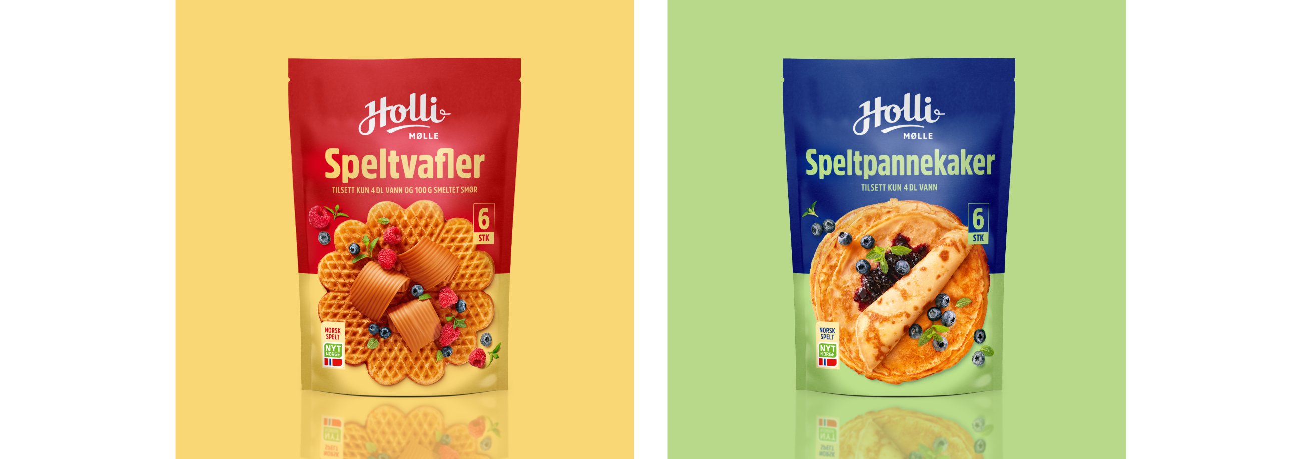
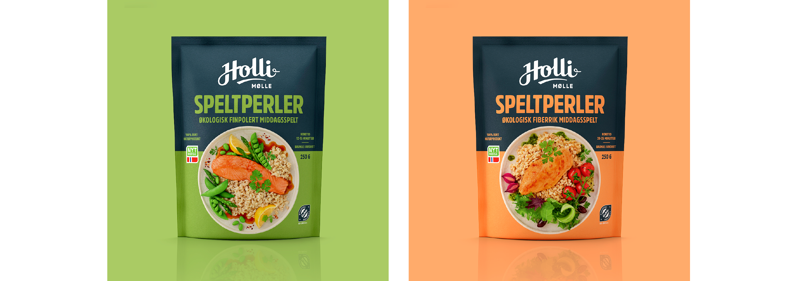
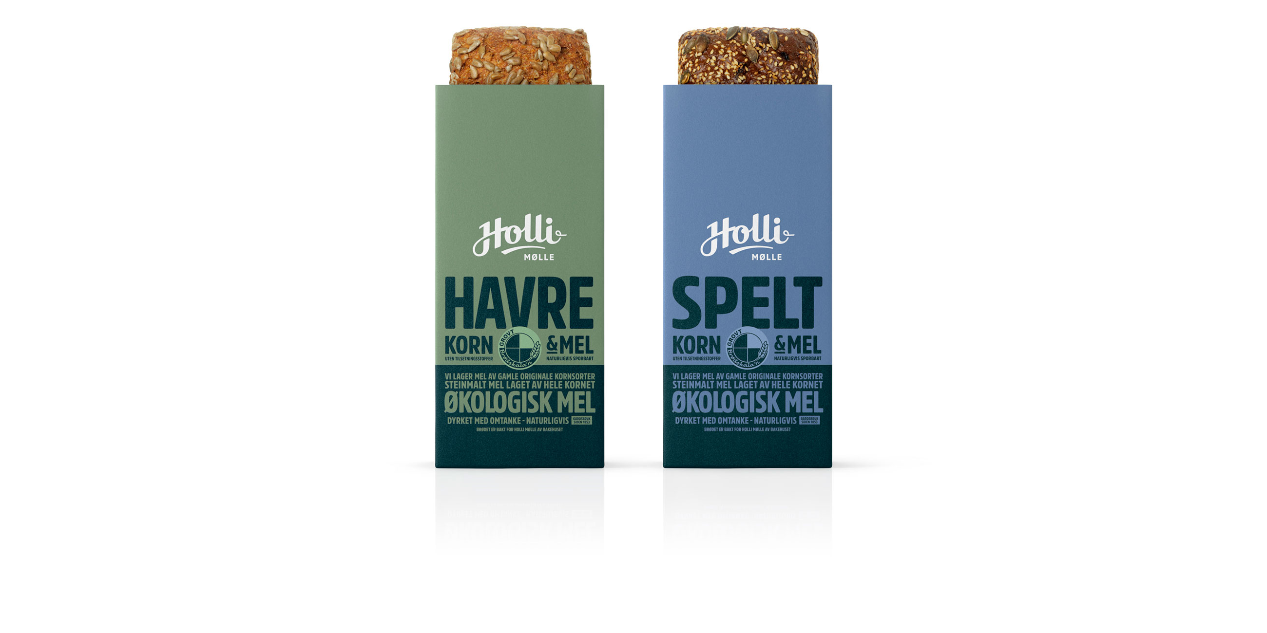
We aimed to communicate Holli Mølle’s business philosophy, which stands out in contrast to the more commercial competitors on the market. The bags’ simple use of blocked letterpress style typography and colour-contrasted panels point to the fresh and local produce in an earthy and honest expression. The new hand-drawn logo has a bold and cheerful character and was crafted using the shape of a half circle – a subtle tribute to a mill.


As a limited set of bags must be used for over 70 products due to small storage facilities, we designed a system of bags that easily differentiates the main product categories from each other. Further flexibility within each category is provided through bright, colour-coded front stickers that read product names. Back stickers include nutritional information, tips and recipes.


