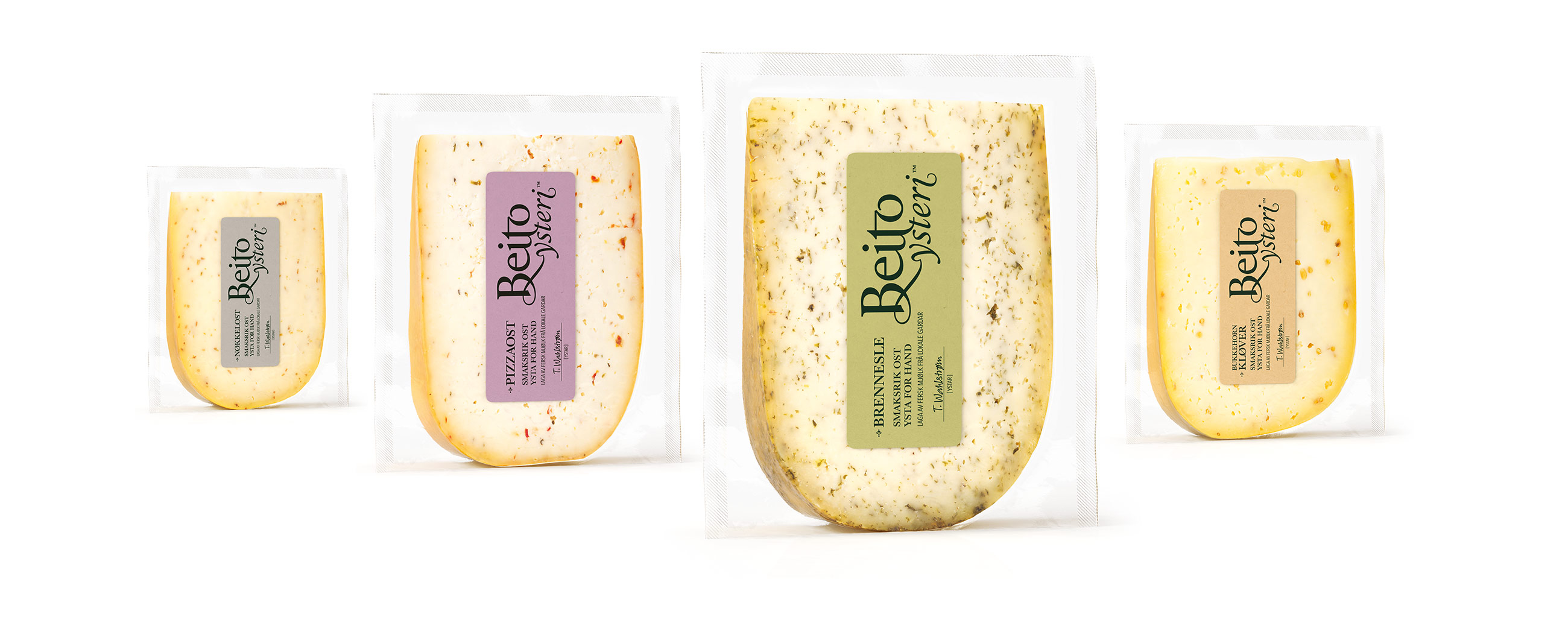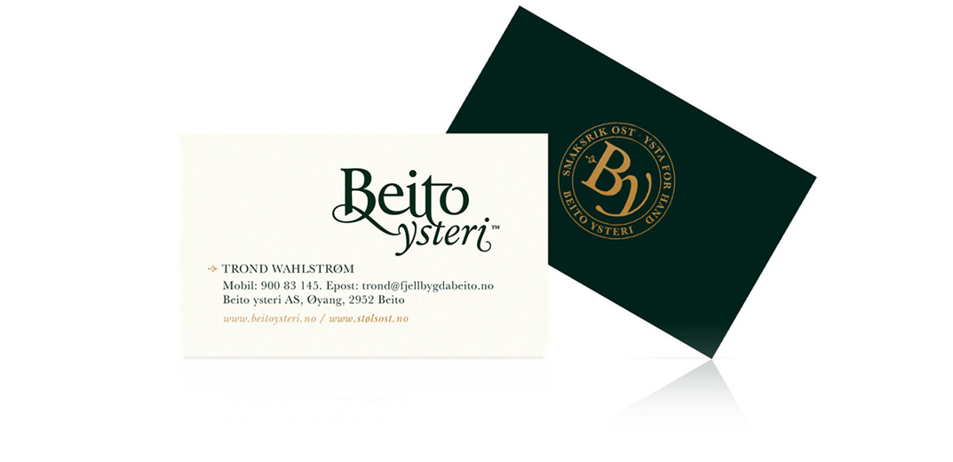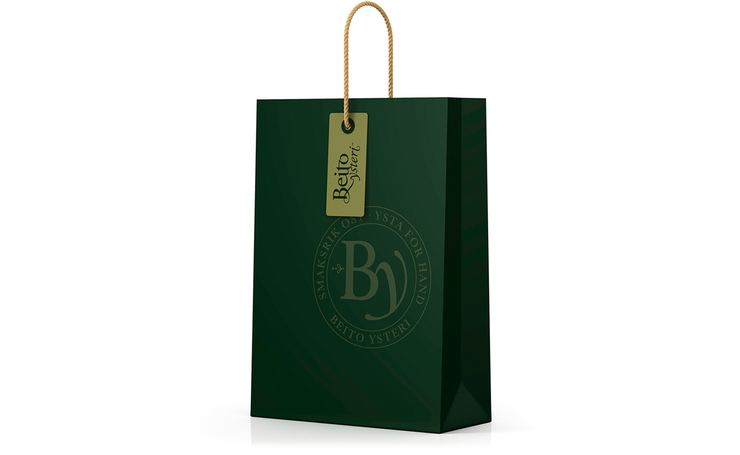
Beito Ysteri is a small dairy located in the region of Oppland, Norway. It creates a variety of artisan cheeses produced on site and with milk sourced from local farms dotted across an unspoilt landscape of lakes and mountains. We worked with Beito Ysteri to establish visual identity and create packaging that would help them to better express the quality and commitment of brand, and the authentic handcrafted individuality of their cheeses.

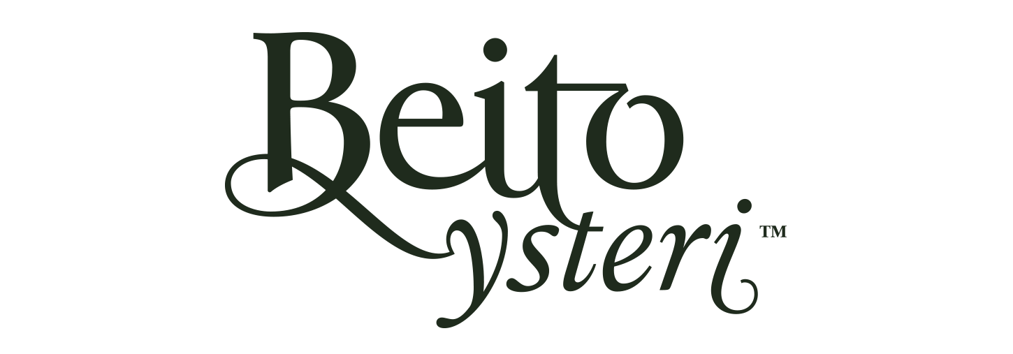
LOGOTYPE – HAND DRAWN TYPOGRAPHY


Our approach is concise in its communicative intentions, yet detailed and carefully crafted in its graphic expression. This can be seen in the choice of colours, which are earthy and distinctive, and through logotype which is a carefully hand drawn balance of traditional serif letters and the creative and unique flourish of unusual ligatures, accentuated loops and swashes.
