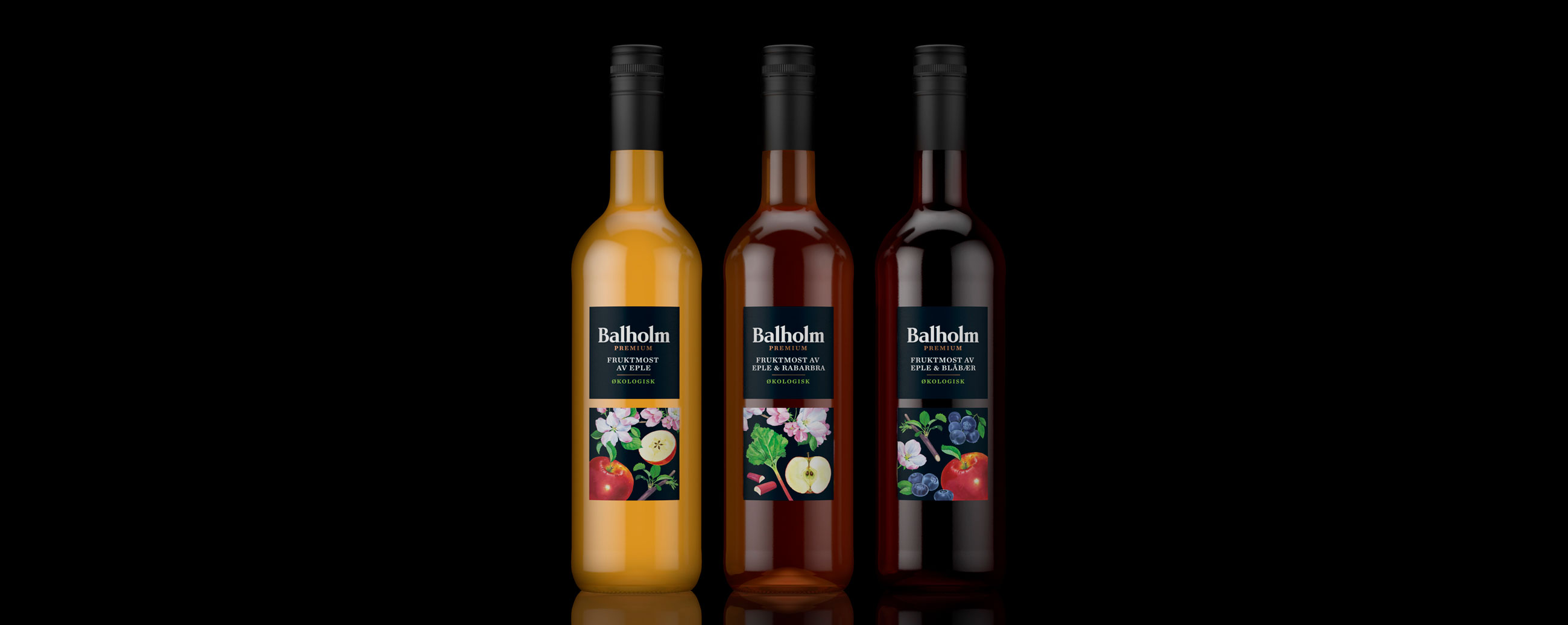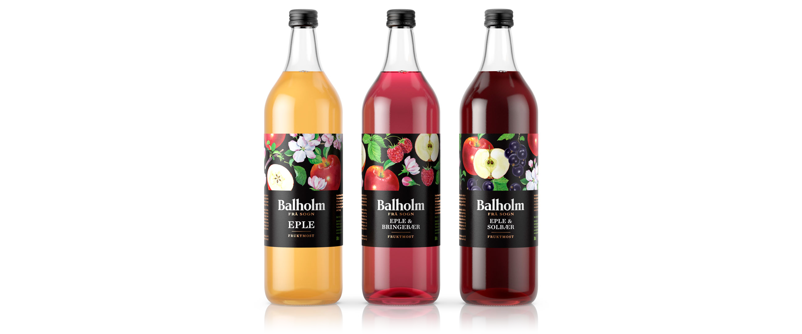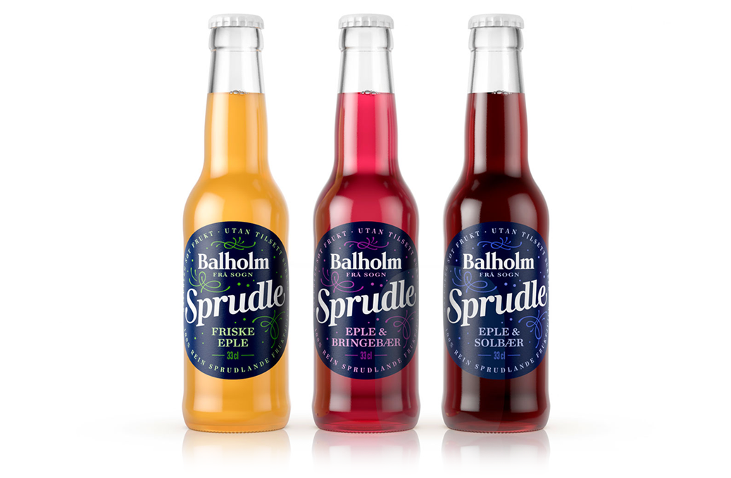
Balholm produces a variety of fresh juices squeezed from fruit and berries grown in gardens along Sognefjorden in Norway. The brand is made up of three ranges. Balholm, which is sold in supermarkets, Balholm Premium created for the retailer Vinmonopolet, and Balholm Økologisk for cafés and restaurants.


LOGOTYPE – HAND DRAWN TYPOGRAPHY
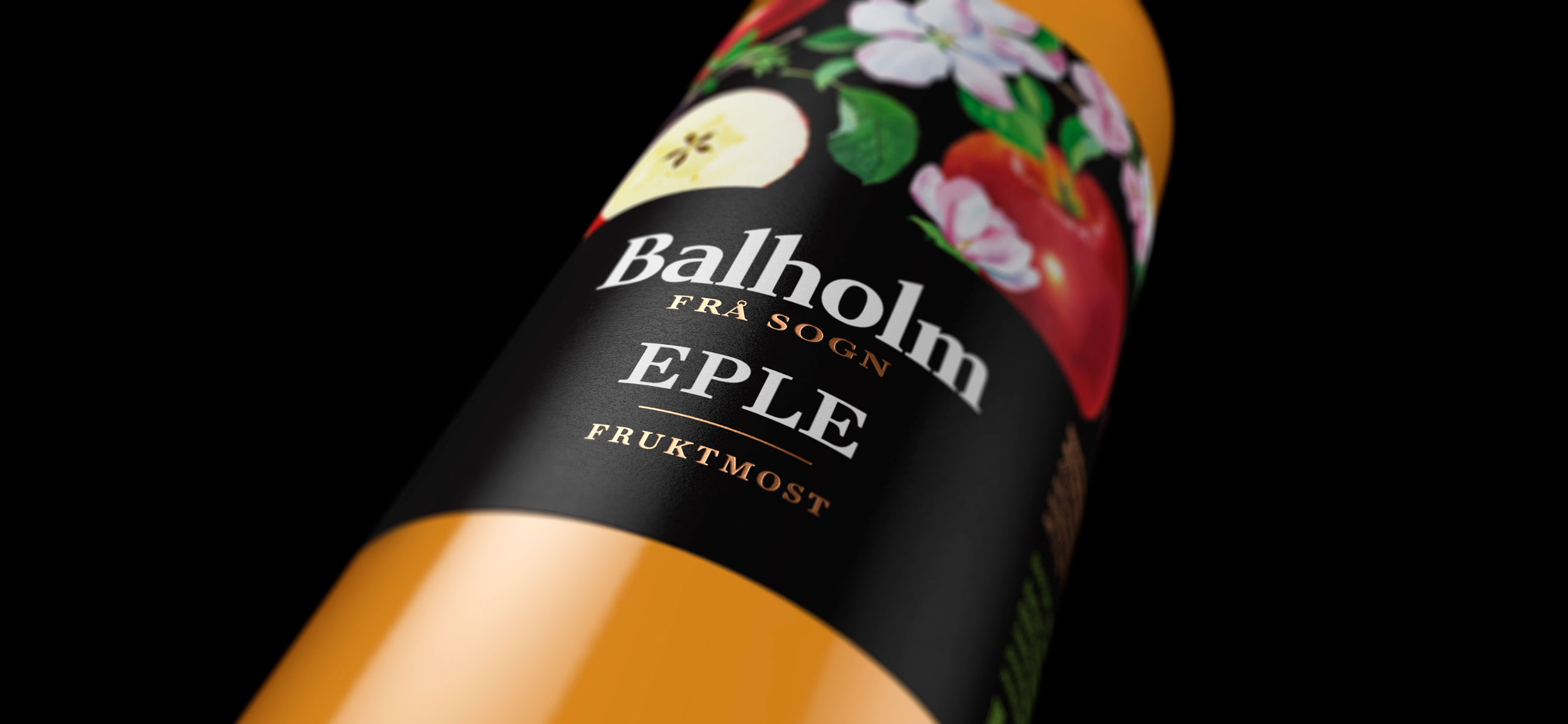
Using a strong and simple logotype with heritage and quality cues, we linked a variety of distinctive structural designs, and through illustration and a gold foil print finish, made a clear connection with fruit content, premium quality and craft. Balholm Økologisk targets an on-the-go market using a unique illustrated image with a youthful energy and a universal ecological component. This plays with an iconic duality in the intersection of leaf and Ø, while colour, informed by taste, provides differentiation.

