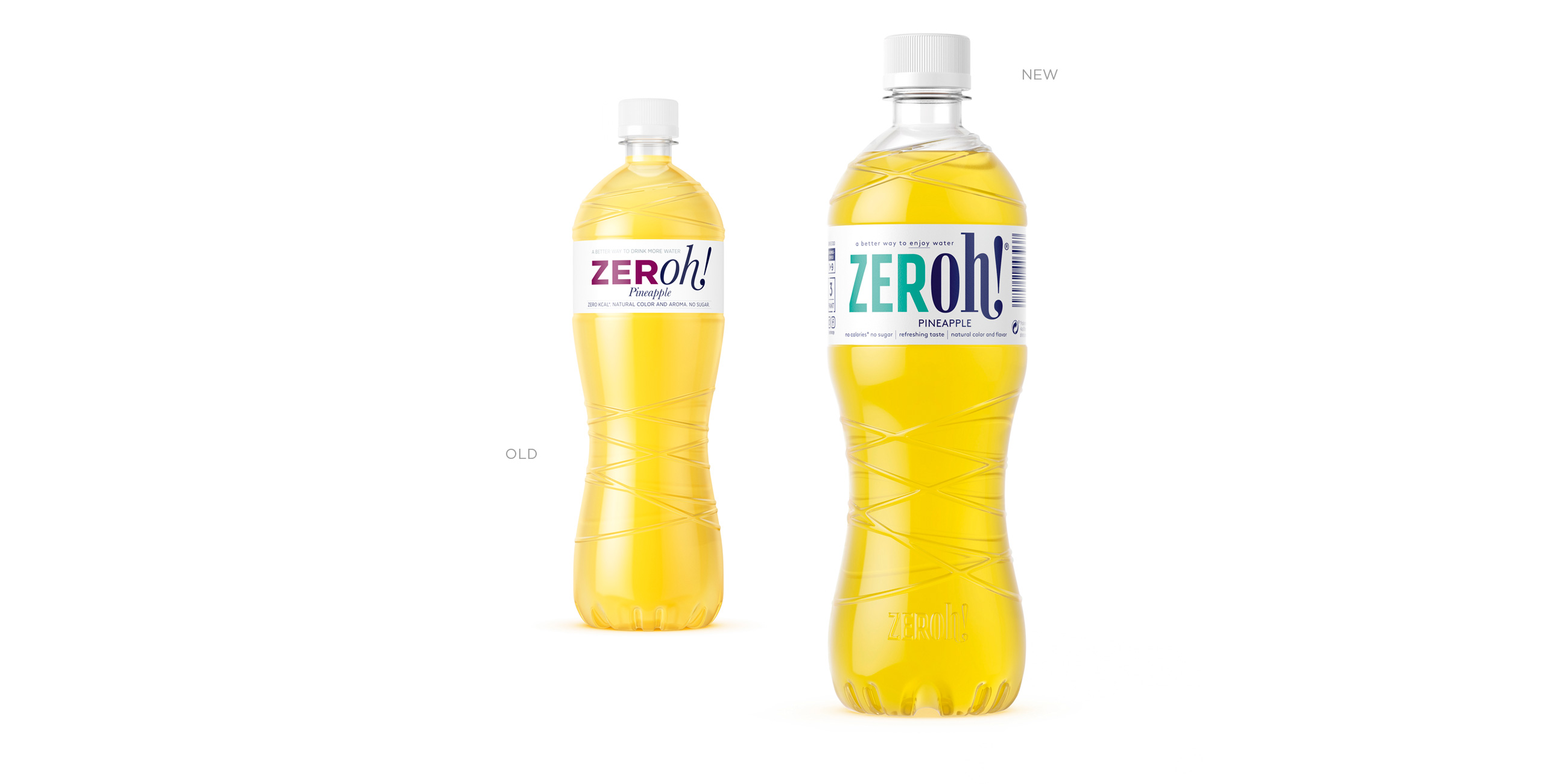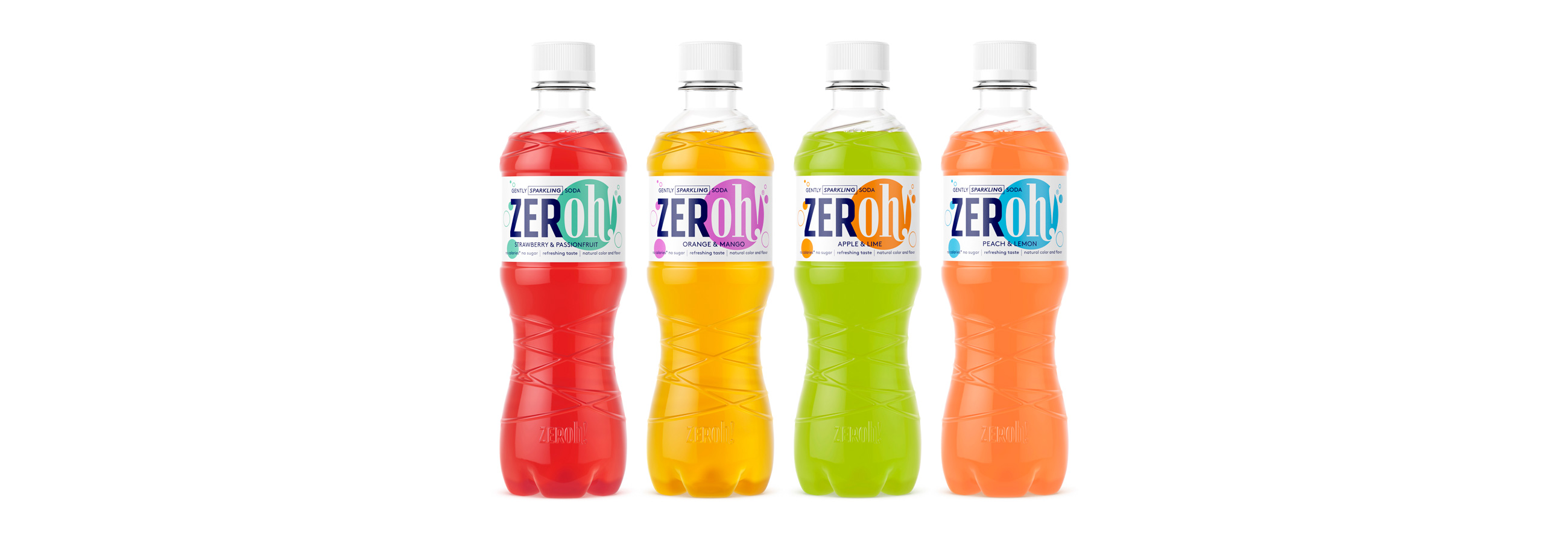
ZERoh! is a sugar-free and zero calorie squash available in a variety of flavours. Half a decade after its initial launch, as ZERoh! became the benchmark brand within Norway’s concentrated low calorie squash market, we revitalised the brand with a new bottle shape and redrawn identity. The ZERoh! success continues with a stretch to new categories such as ice pops and sodas, and it has now entered an international market.

LOGOTYPE – HAND DRAWN TYPOGRAPHY
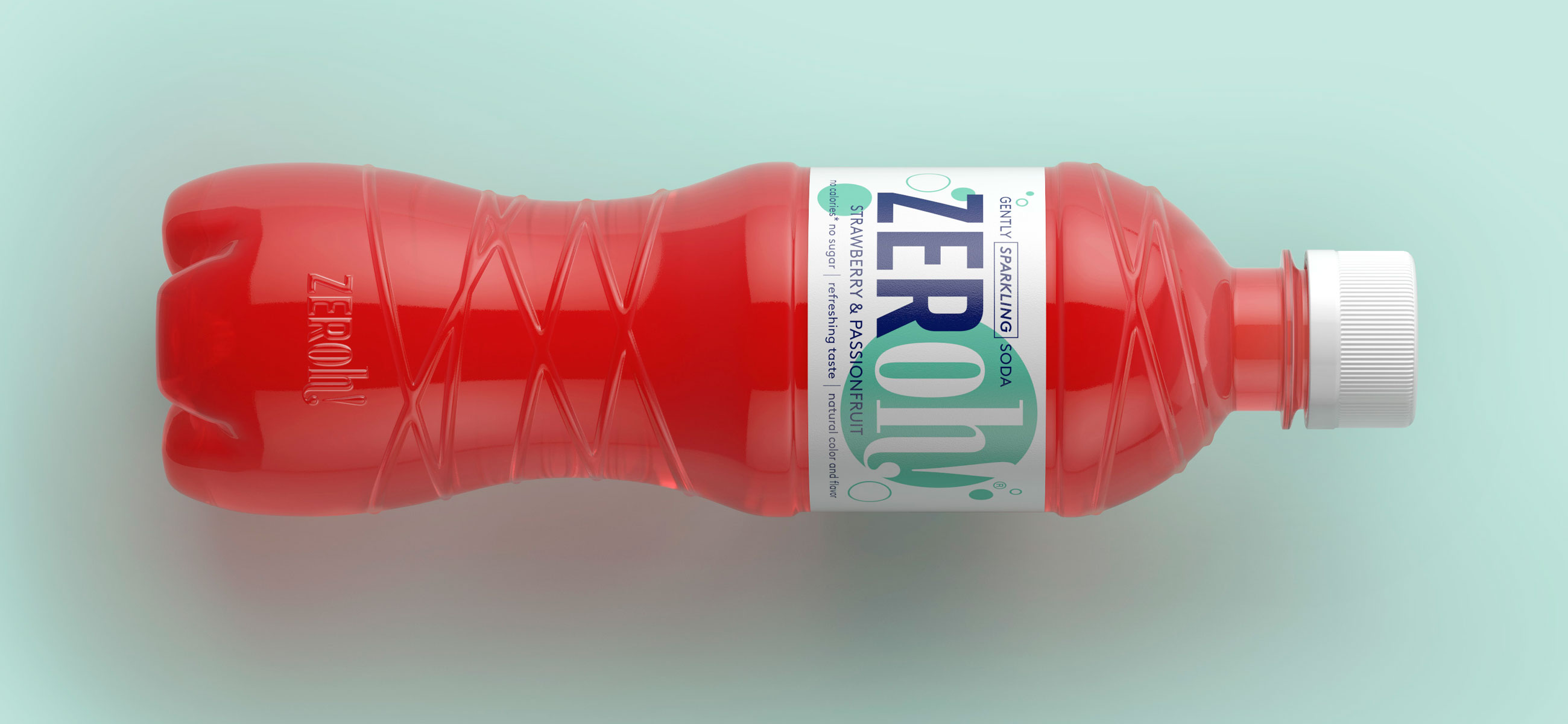
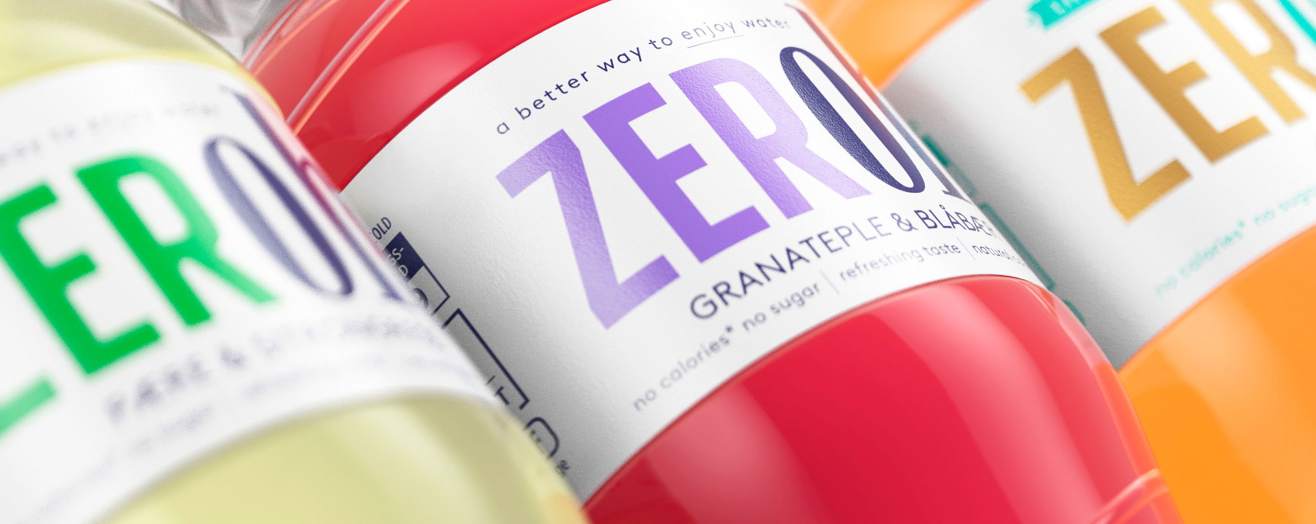
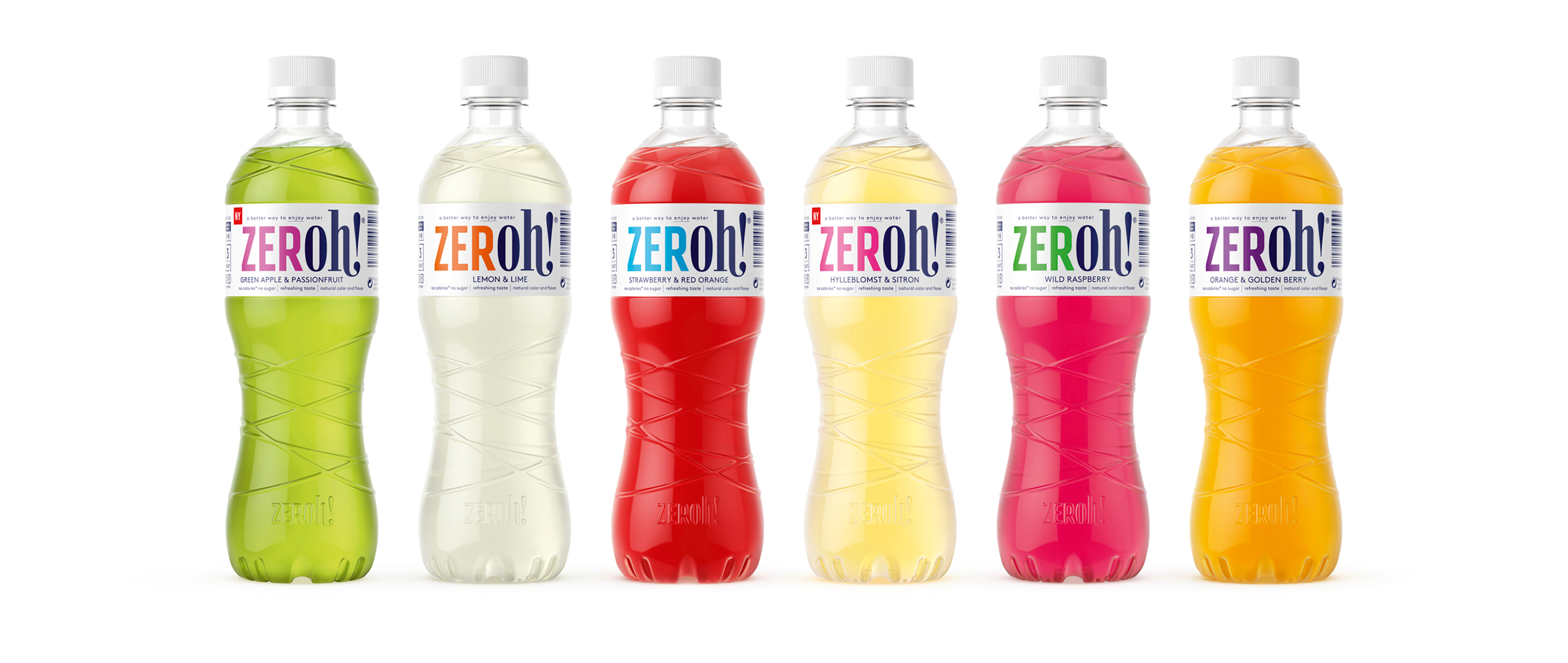
Our visual identity, bottle structure and packaging design, which intended to position flavoured water as being a better way to enjoy water, still balances a distinctive and memorable structural design, light label and fruity colour palette with a modern and expressive logotype of hand drawn characters with contrasting dynamics. This logotype, through colour and special inks, delivers a flexibility that can accommodate limited editions and a range of product categories.