Viken Gartneri Frosta is a family owned nursery, located on the small Norwegian island of Frosta. They produce leaves, herbs and salads using an extensive generational knowledge, and a philosophy rooted in “good things taking time”. Viken Gartneri Frosta believes that a process of natural rather than accelerated growth, without the aid of pesticides, leads to higher quality and greater tasting products.
With a desire to re-establish their dominant position in the market, to leave no doubt that Viken Gartneri Frosta has the freshest and most flavourful salads and herbs, they commissioned us to rethink their brand identity.

LOGOTYPE – HAND DRAWN TYPOGRAPHY

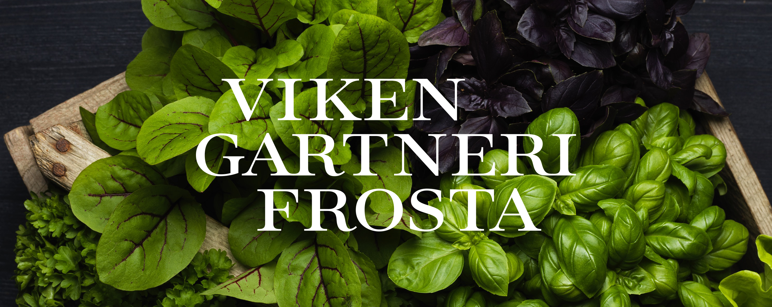
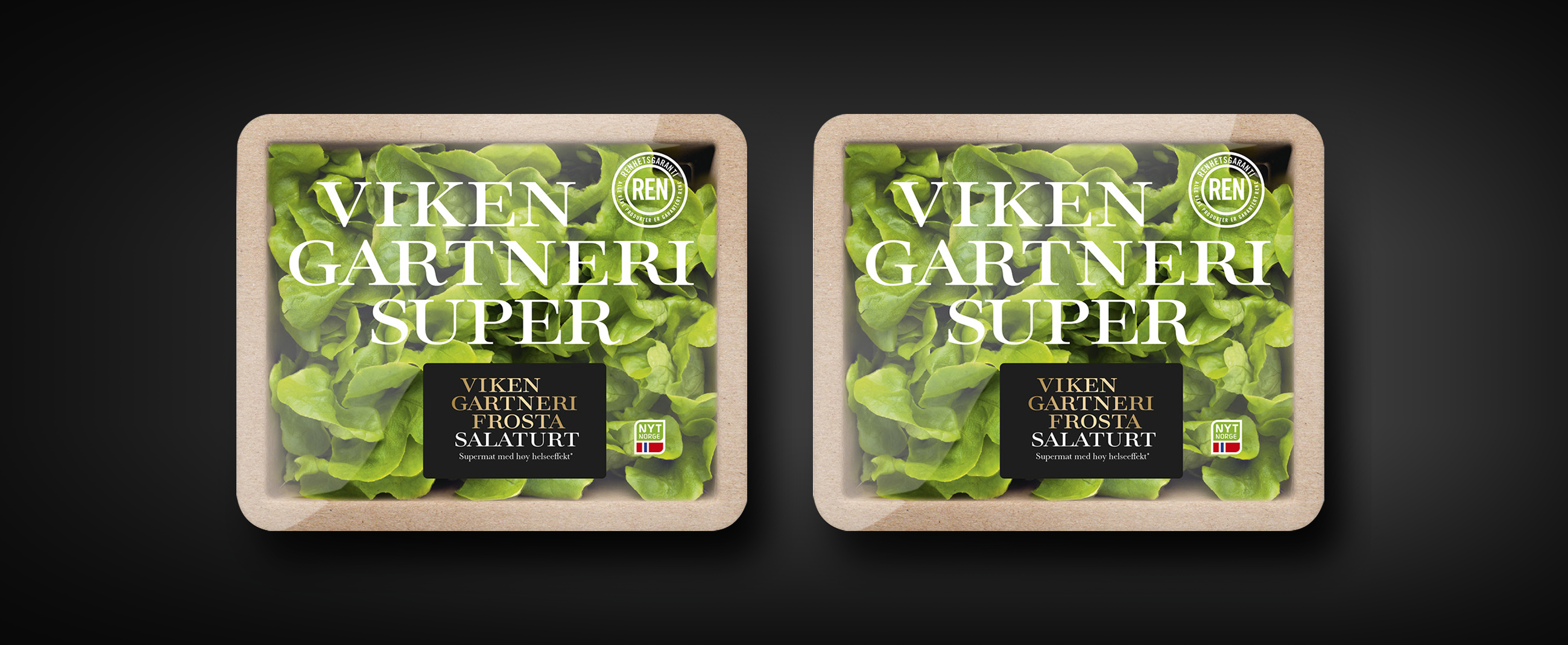
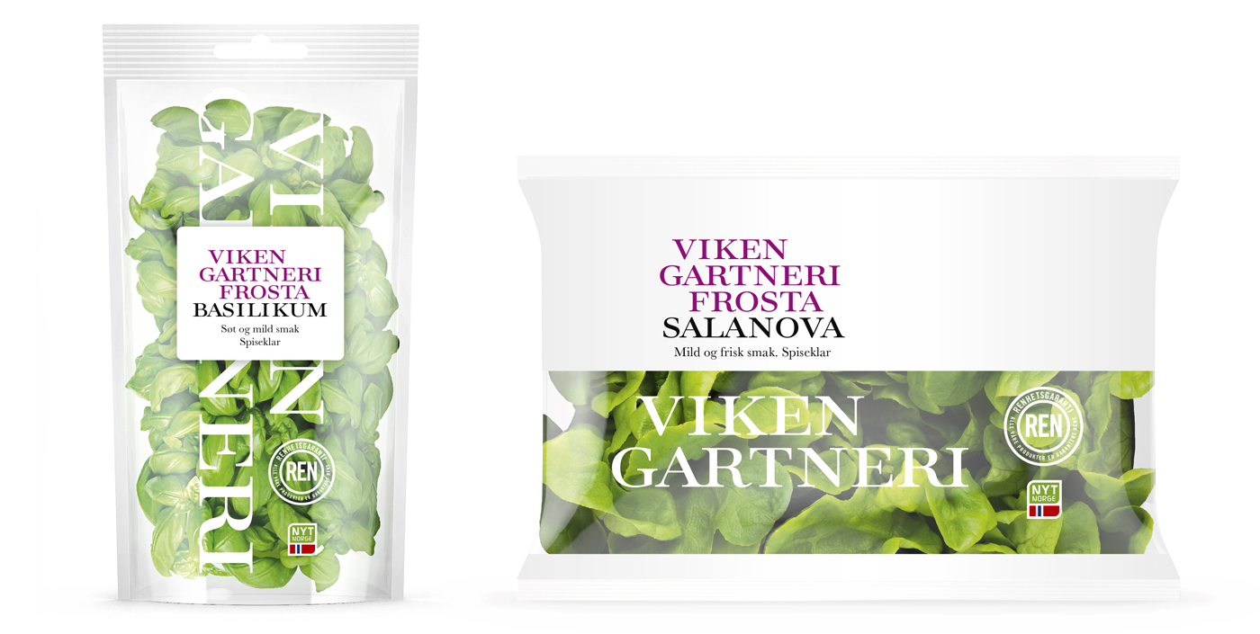
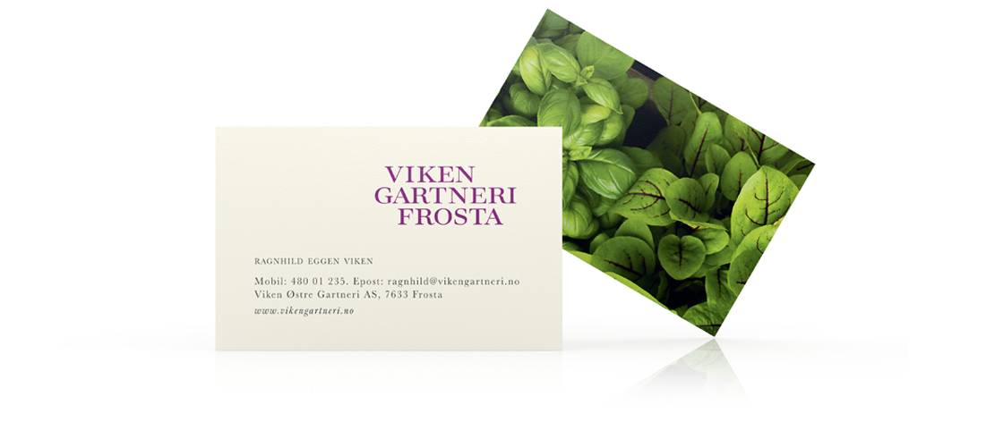
We replaced a previous design that lacked freshness and felt “old” with a bold, modern and innovative expression that would also convey a commitment to quality and natural growing methods. We achieved this through a hand drawn logotype, rich, detailed and naturalistic approach to photography and a bright and distinctive purple enhanced by white. This balances freshness with a distinctiveness in line with the innovative thinking of the nursery.

With the redesign for Viken Gartneri Frosta we wanted the produce to be the star and with photography and clear packaging playing an important role in the new concept the typography had to work with, and on, various backgrounds successfully. With an open, slightly extended feel and high contrast structure it fufills the demands placed on it with aplomb, working well in multi-line stacks that allow for clear and concise expression.

