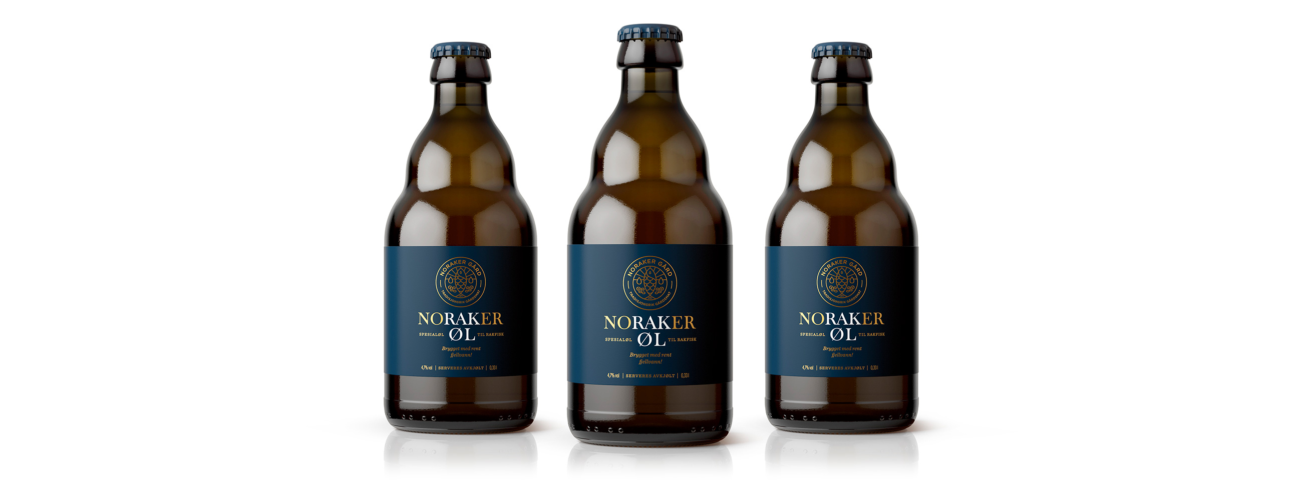
Noraker Gård is a farm located in the small village of Aurdal, Norway, and is in the hands of its 14th generation. Noraker gård has established itself as a quality leader and helps to preserve and develop the ancient food cultures of the region, one of which is “rakfisk”, a semi-fermented fish.
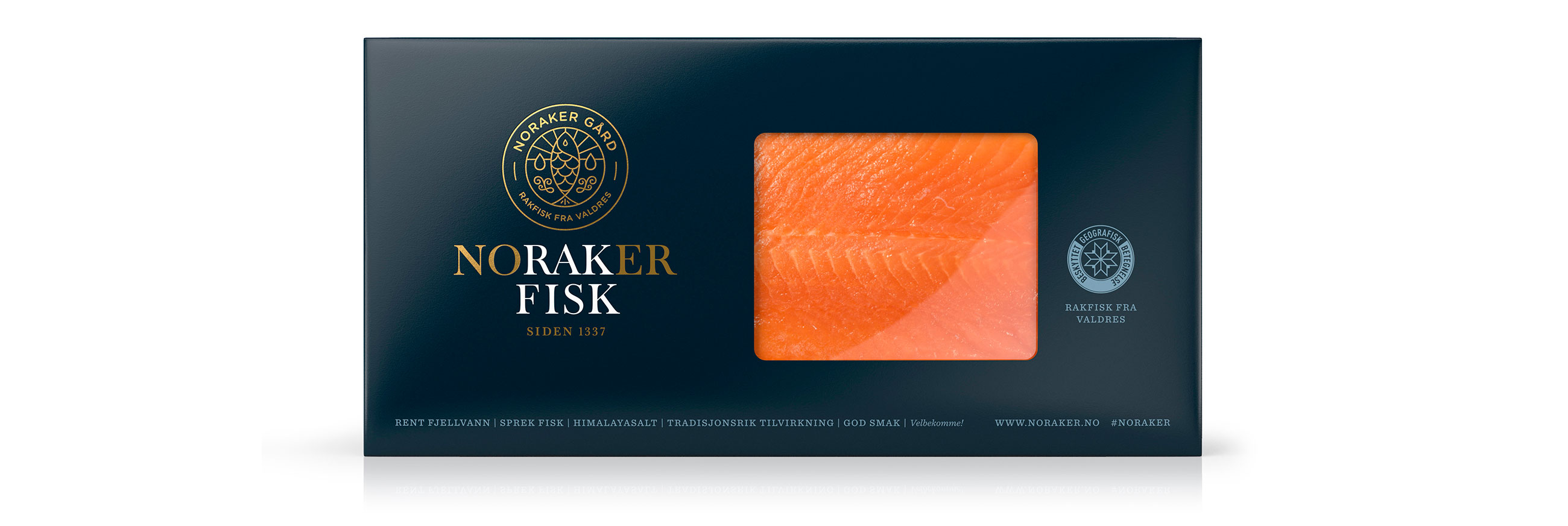
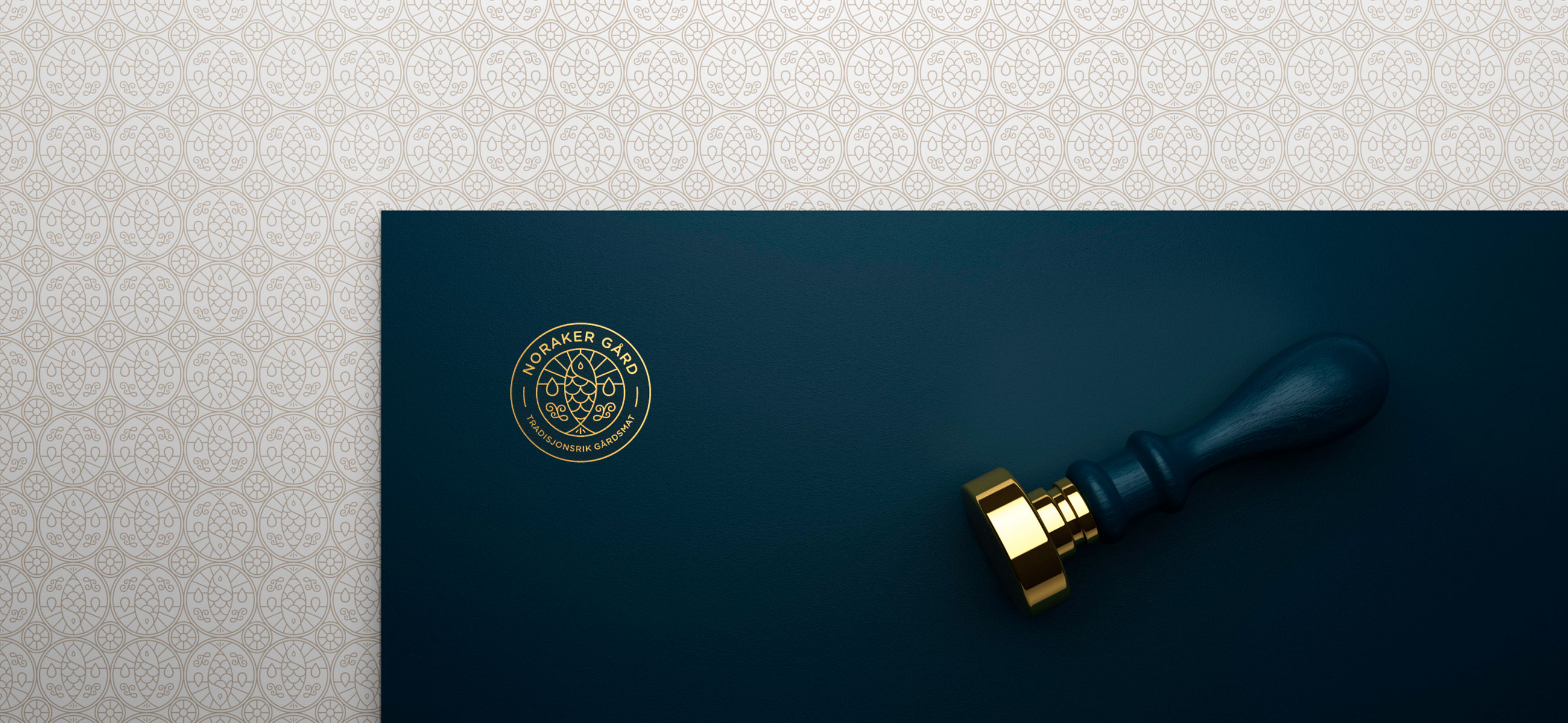
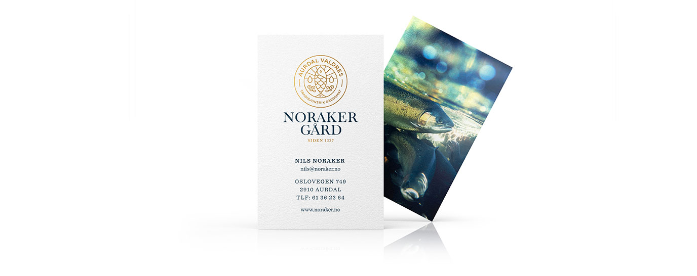
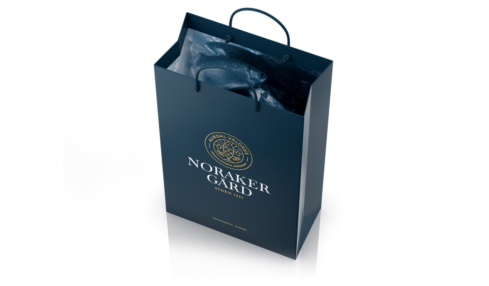
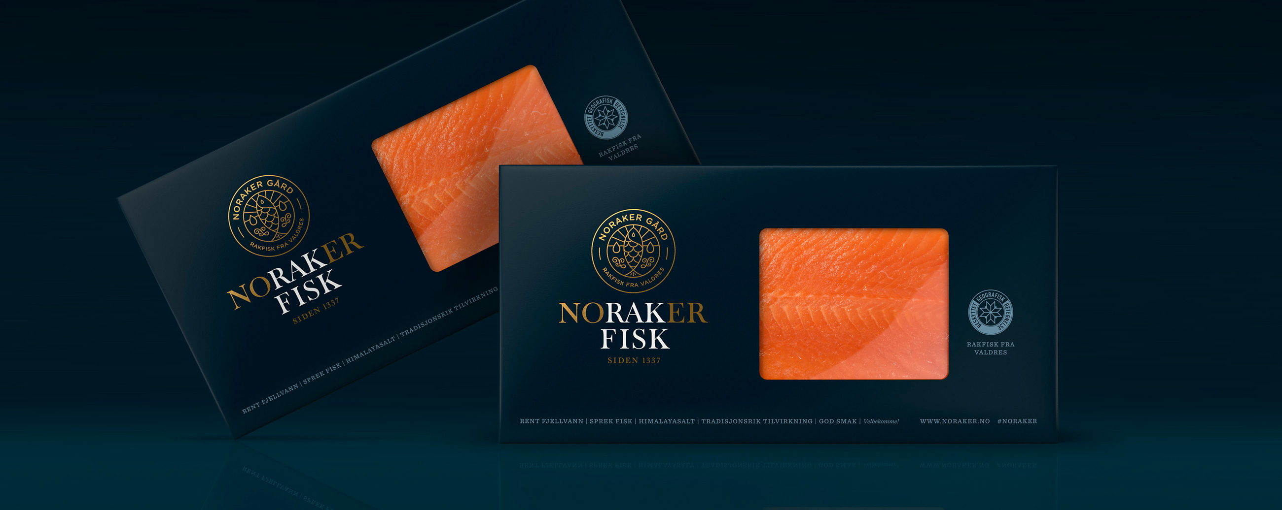
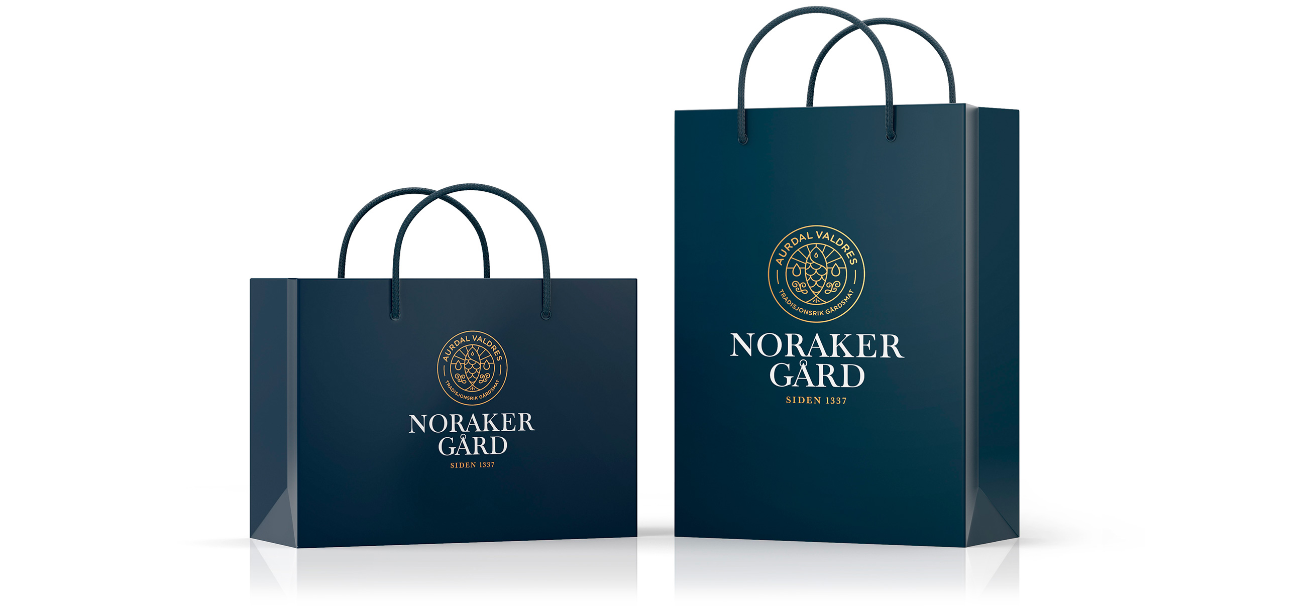
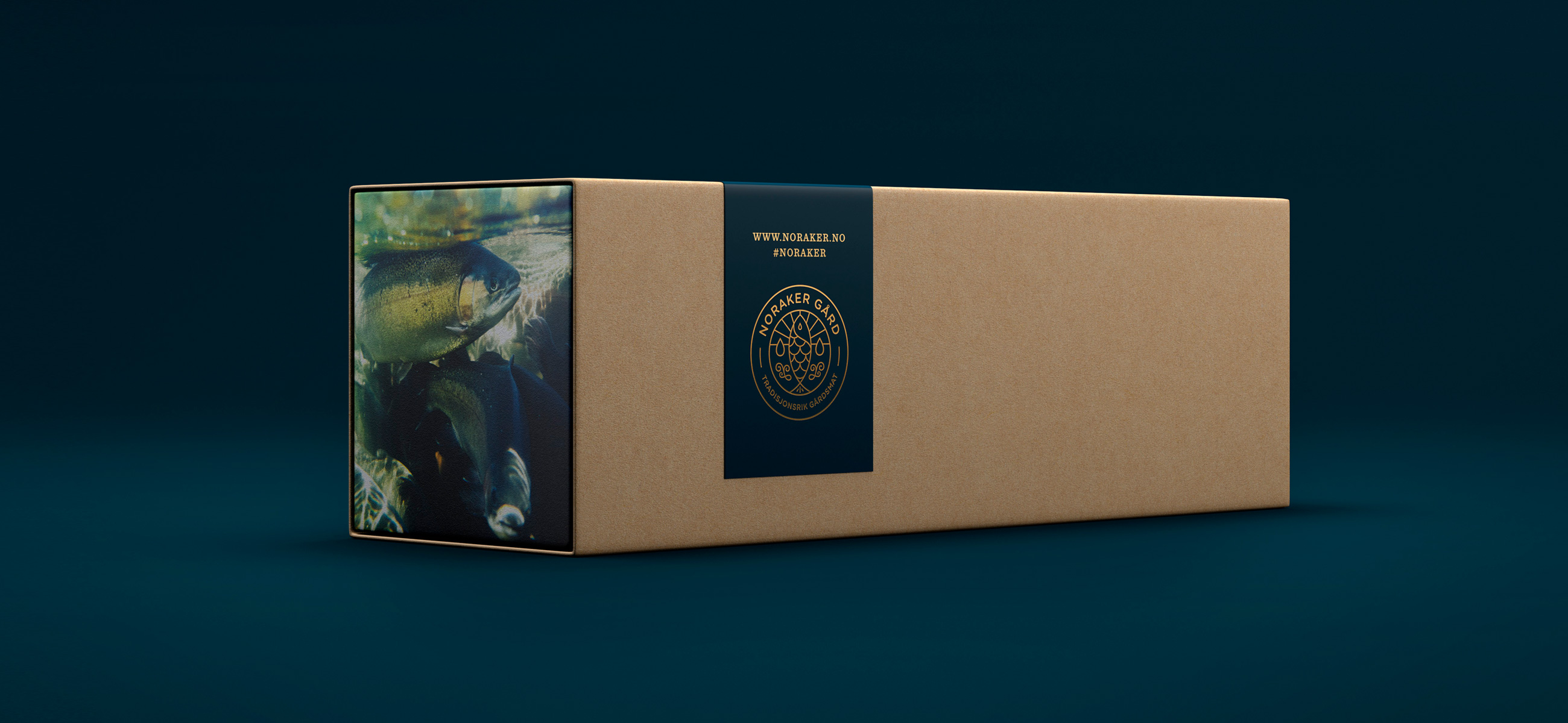
Working with Nordaker Gård we created a new visual identity and packaging design that articulates, in a visually compelling way, the culture, traditions and quality integral to the brand. Through the use of fine lines, a bronze foil print finish, a serif logotype and imagery that calls to mind fish caught in a continuous flow of fresh water, we balanced modernity and legacy and conveyed quality and freshness. Colour contrasts and finish derive impact, distinction and a sense of the premium. By drawing out “RAK” and “FISK” from Noraker Fisk using white, we added a playful and memorable detail tied to the unique food legacy of the region.
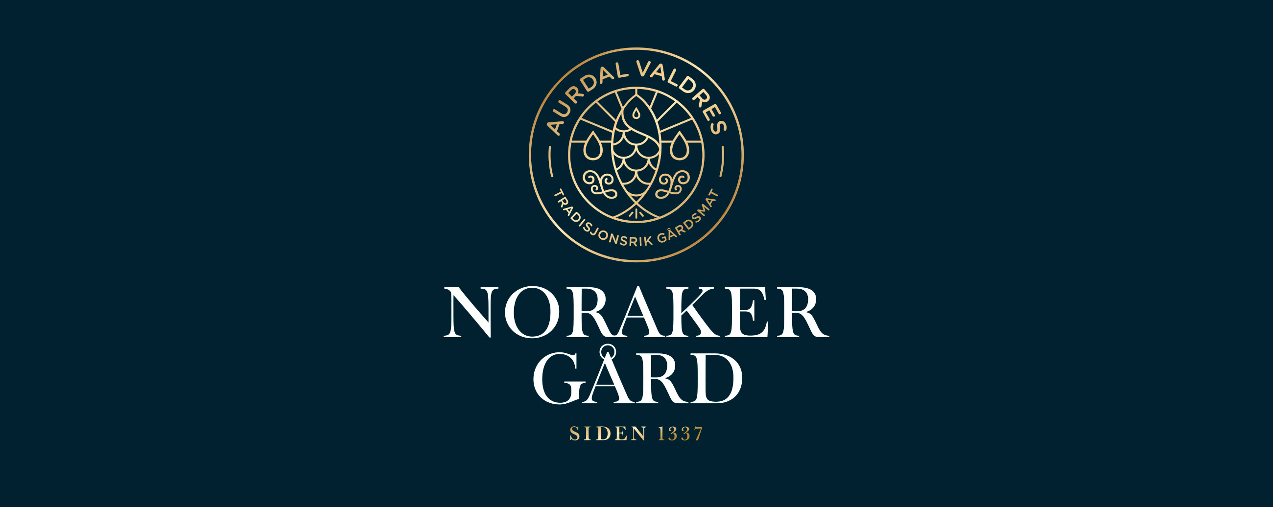
It is not uncommon for type to have to perform a number of almost contradictory functions. With the Noraker logo we wanted it to project a modern feel yet be classic, be friendly and approachable yet authoritative and all the while exude quality, dependability and innovation. To help us achieve that we developed a logo that has elegant yet strong serifs, classic proportions but with some variation, a modern vertical stress with a weight of stroke that provides strength while not being overpowering and a stroke contrast that lends authority and confidence with some subtle variations in repeat letterforms to give a unique solution.

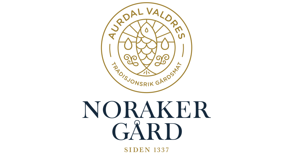
LOGOTYPE – HAND DRAWN TYPOGRAPHY
