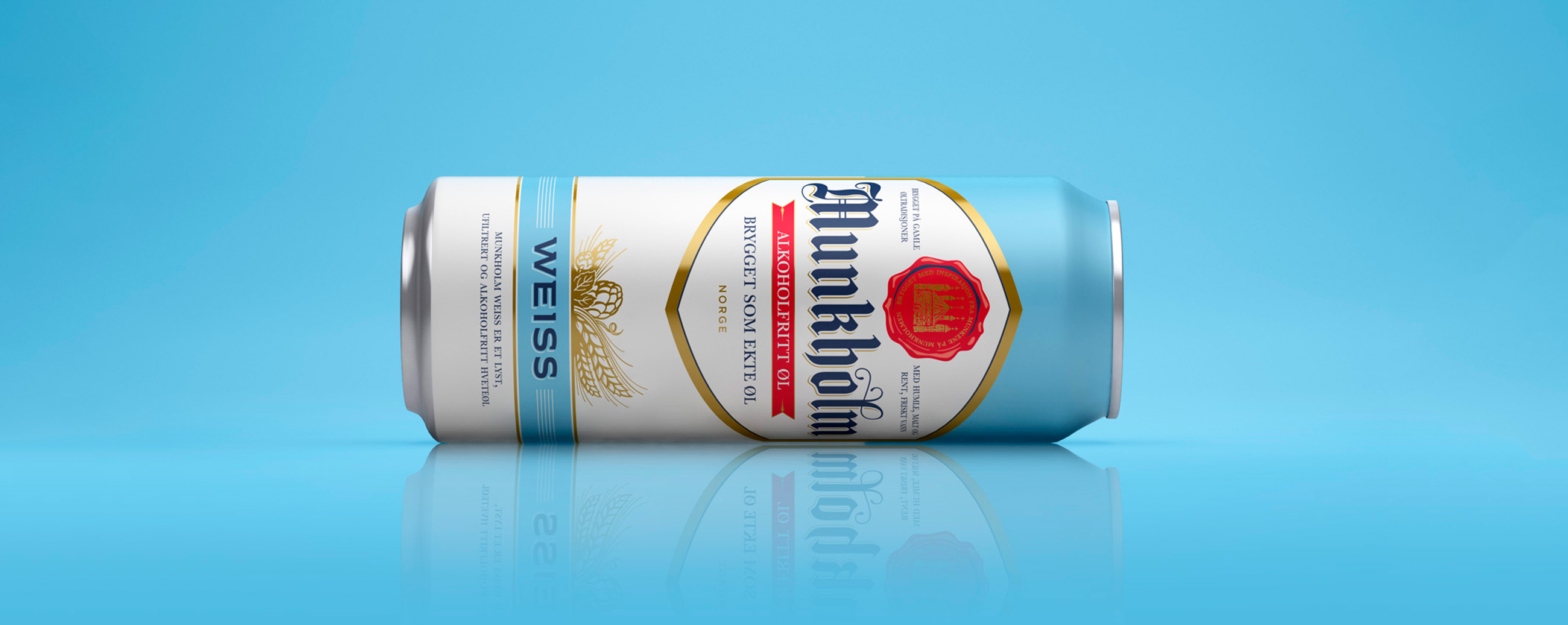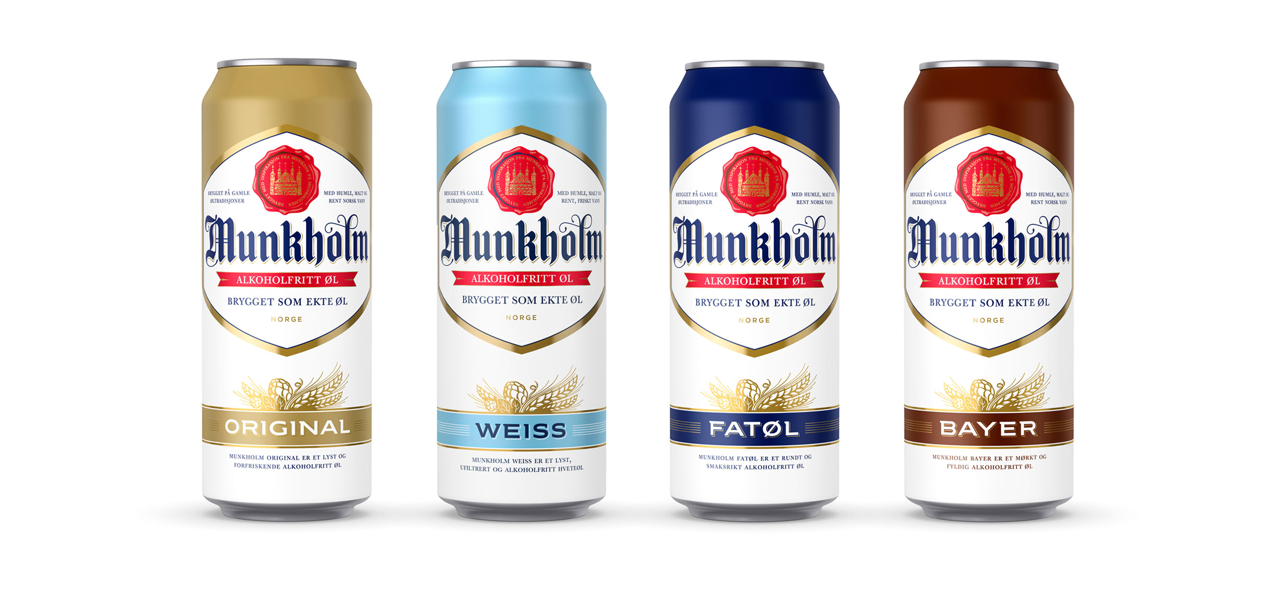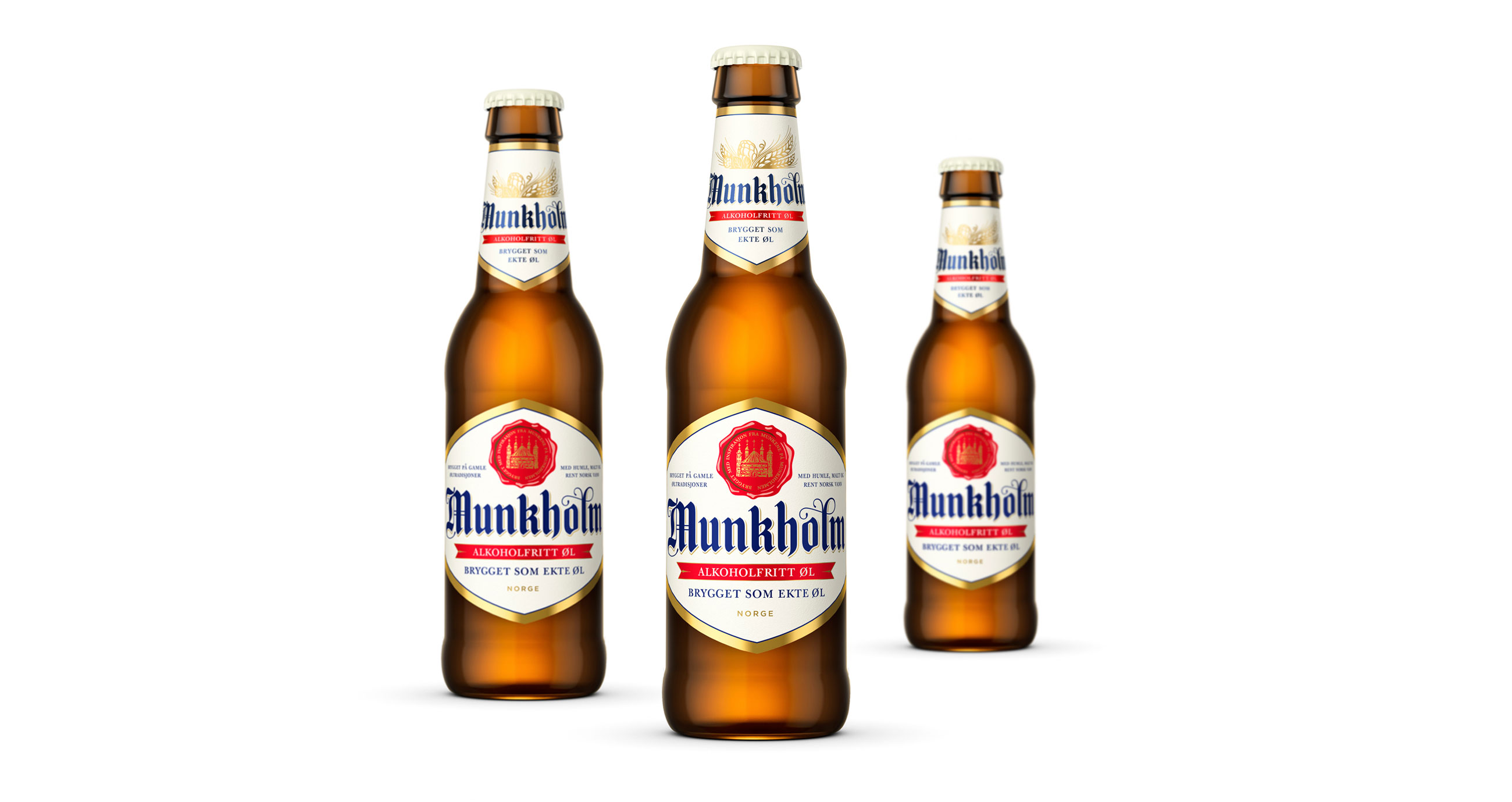
Munkholm has a significant heritage, and has grown to become Norway’s largest non-alcoholic beer brand. With a desire to improve the communicative clarity and visual character of each of Munkholm’s different beer types, and to make the most of the brand’s legacy of beer brewing, we worked with the brand to develop a new and compelling packaging design.


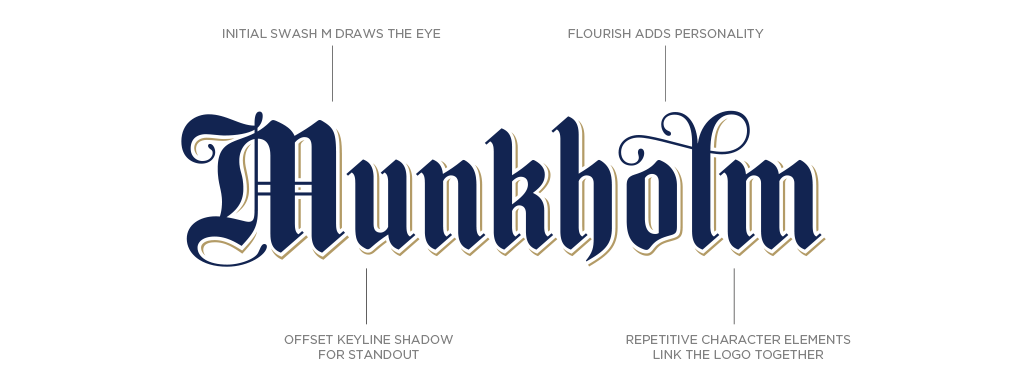
We were very conscious of the need to maintain the typographic context for Munkholm whilst reinvigorating the design. Inspired by the historical connection between monks and scribes the logo evolved from its previous form to present a cleaner, stronger impression with improved shelf presence .We developed a letter with a modern feel that reflects the clean taste of the non-alcoholic beer.


LOGOTYPE – HAND DRAWN TYPOGRAPHY
Using a combination of hand drawn logotype and lettering, areas of white space and solid colour, a wax seal, gold detailing and a better use of space our solution emphasises the craft and tradition of beer brewing in a contemporary way, whilst staying true to the iconic look of the range. This approach is used alongside a redesigned 0,33l glass bottle and newly launched 0,5l can.
