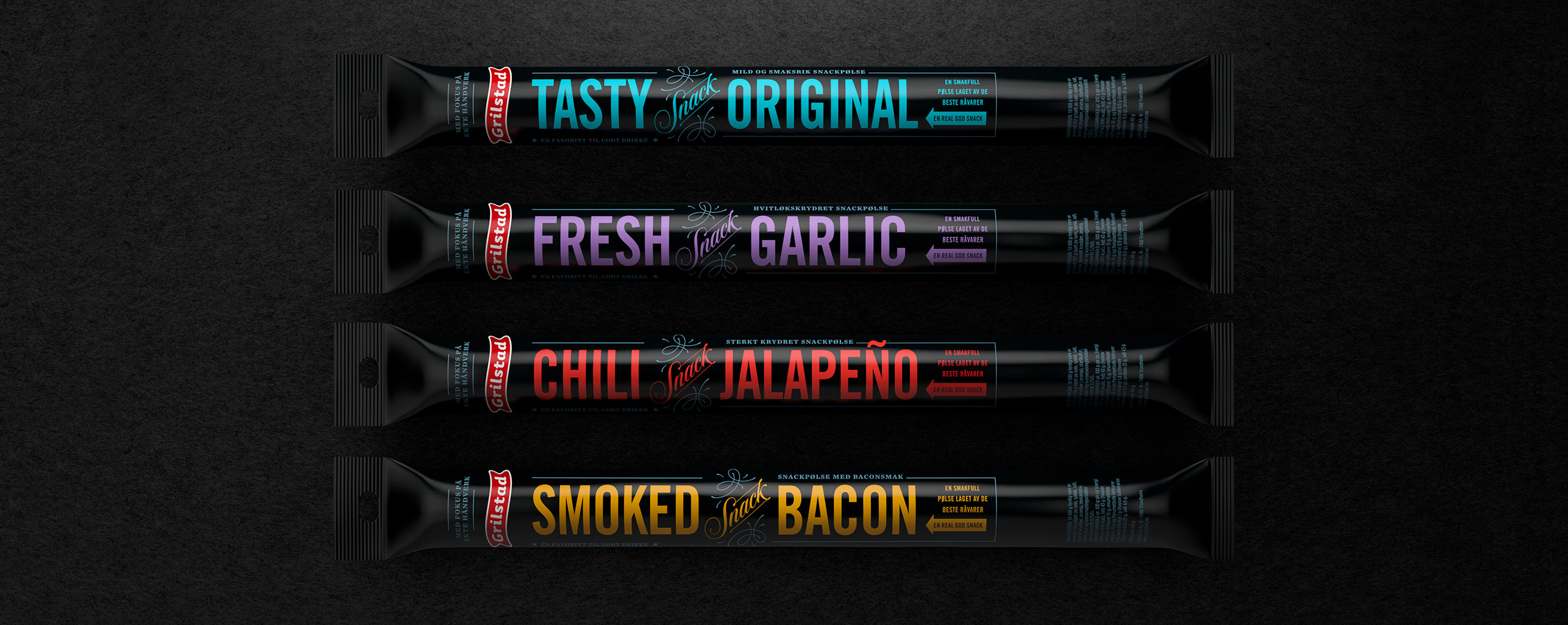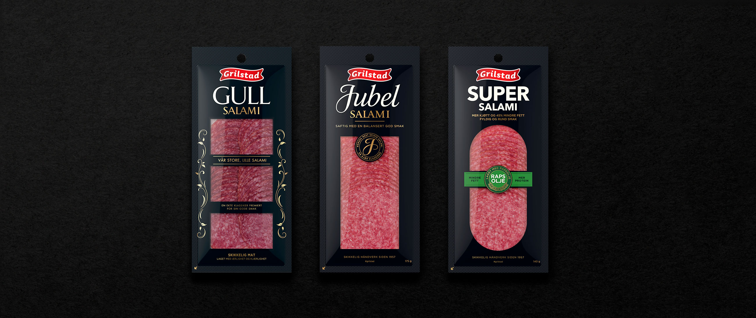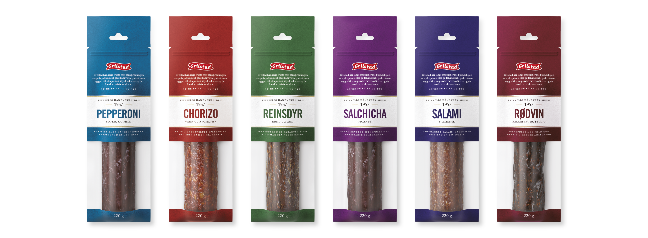
Grilstad has established a reputation for high quality ingredients and experienced butchery. With a desire to retain established brand equity and to build on its legacy, whilst also bringing its visual identity up to date, we worked with Grilstad to revitalise the packaging for their best selling range of cured meats and sausages.
Using a black and gold colour palette, clear product views and a bold typographic variety, our design delivers a strong sense of brand character and product quality. It balances consumer familiarity, tradition and history, with premium quality and modern shelf impact. We augmented the graphic with a durable structural design with a unique twist off lid, satisfying both practical and stylistic considerations through its robustness and distinctive shape.


Grilstad’s cured sausage range is available in a variety of flavours, sized and packed conveniently to share at home or on the go. It is a traditional and enduring format. Our design reflects this through eye-catching blocks of colour and bold type, paired with heritage cues and a clear product view.

Grilstad’s Heia salami range was created to satisfy the milder palette of children, yet remains packed full of flavour and protein for healthy growth and plenty of energy. Acknowledging the unique qualities of product, we developed a design that blends a visual appeal aimed at kids with the practical considerations of parents. This was achieved through bright colour, compelling typography and illustration of energy and outdoor action, and a structural design of two compartments that can be divided and placed right into the lunch box.
