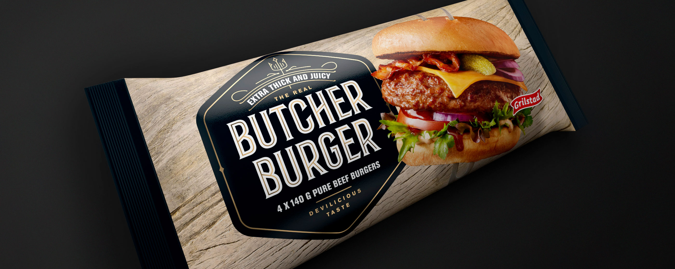

As one of Norway’s largest producers of meat products, Grilstad wished to launch a premium frozen burger unmatched in its thickness, richness and juicy flavour profile. We created a new identity, concept and packaging design that positioned the Butcher Burger as a product that exceeds the expectations of its category. When launched, the burger was recognized with a Gold award and first place in the national NM in Meat Products, and the Butcher concept was soon expanded into a larger range of compelling, premium meat products.
Our aim was to position the Butcher Burger as a quality product equal to the quality of fresh meat - straight from the butcher - and bring to light its extra thick and juicy qualities while capturing the interest of the burger and barbecue enthusiasts. We therefore created a persona, a credible sender, located in a traditional butcher’s shop, The Butcher.
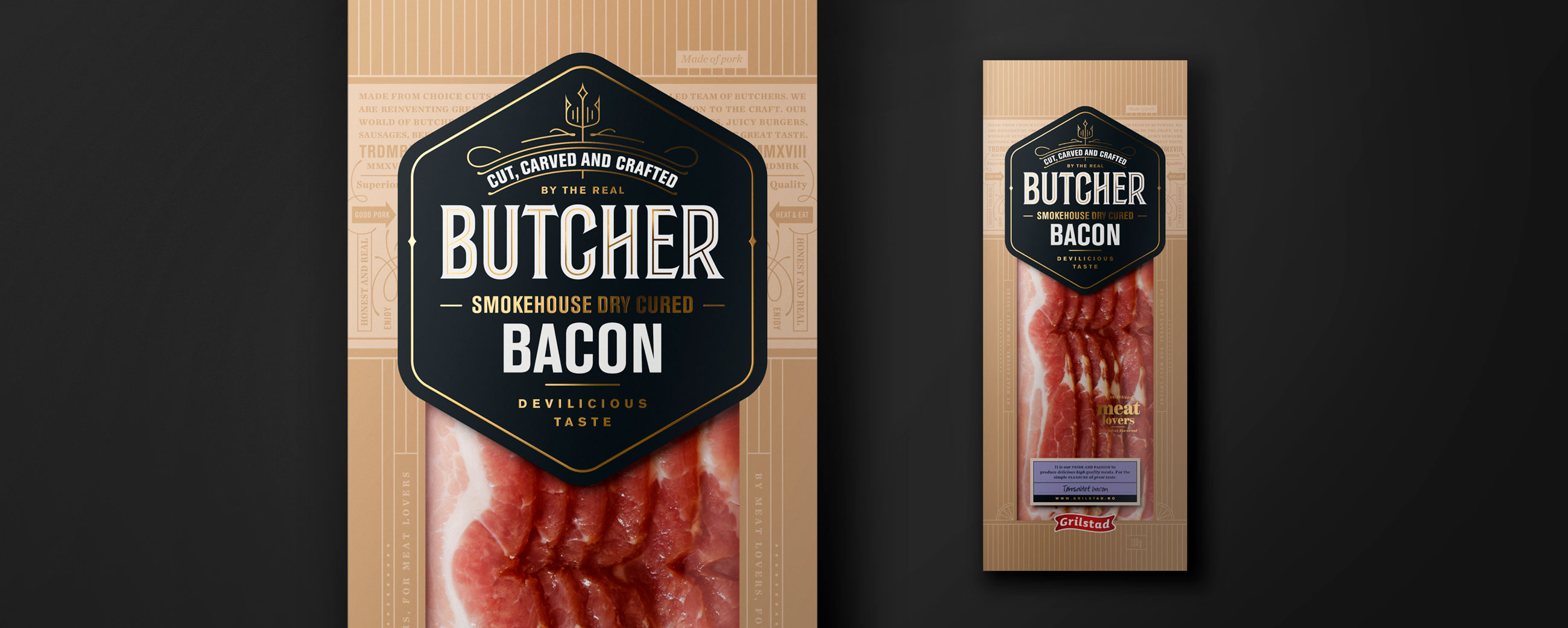
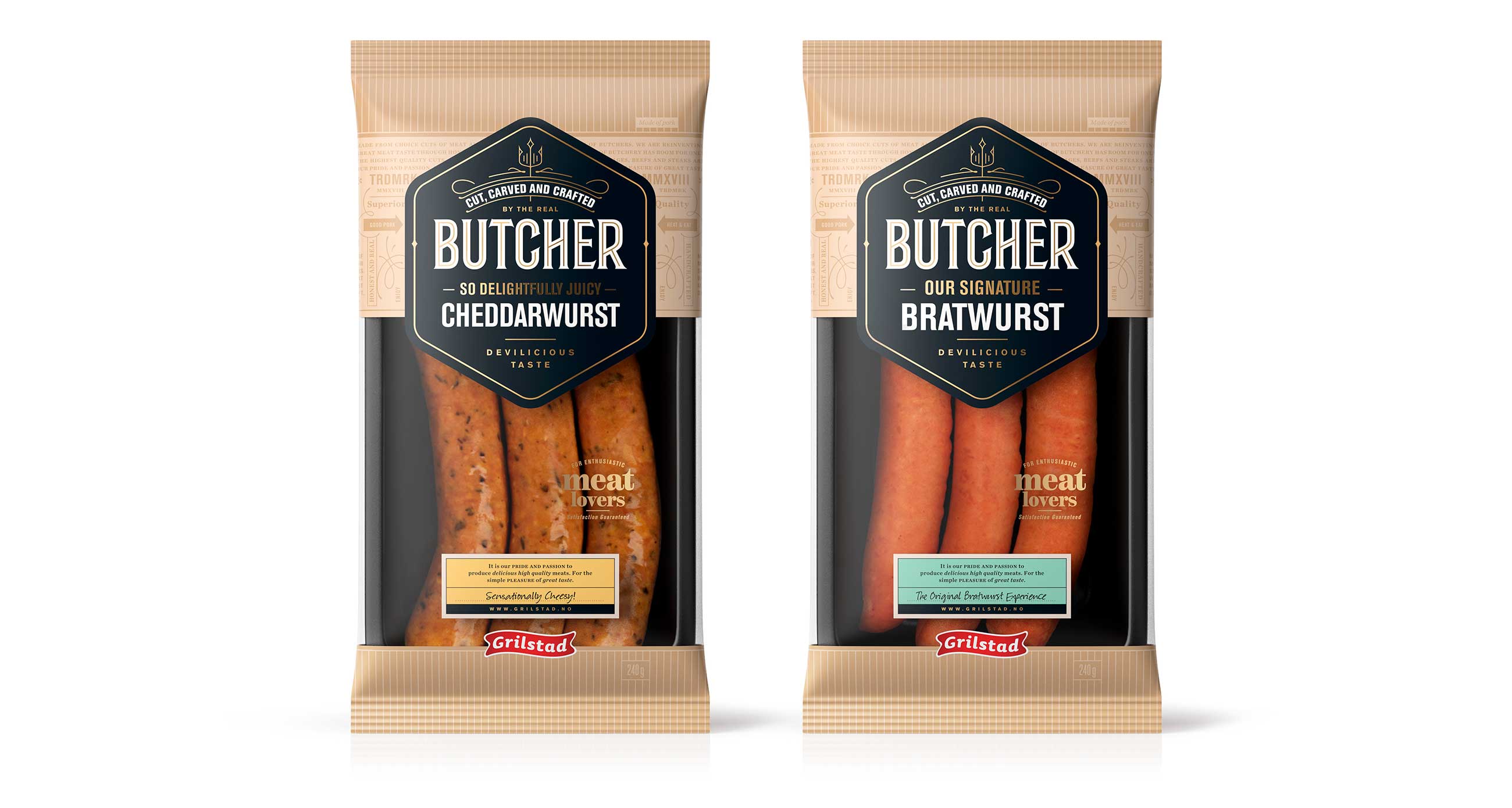
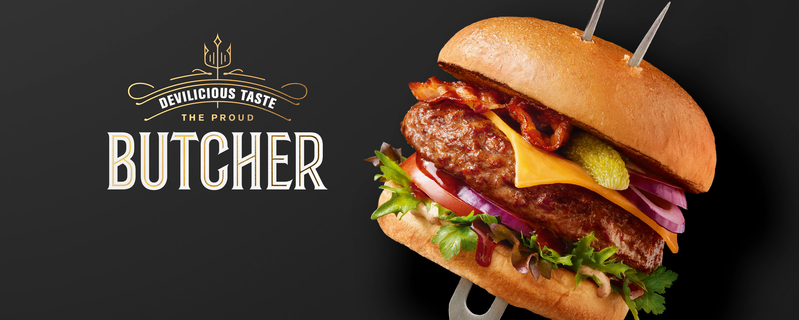
Through playful devil allusions in words and imagery (a butchers fork doubling as devil horns rising from the burger bun, a traditional pitchfork crafted in to the wordmark itself and playful quotes such as ‘devilicious taste’ functioning as a concept summary) and by pairing the visual language of traditional butchery such as type, foiling and wood texture we created a product identity that allows you to indulge in a “devilish” taste experience. A ‘naughty but nice’ product of superior quality - thick, flavorful and juicy.
LOGOTYPE – HAND DRAWN TYPOGRAPHY
