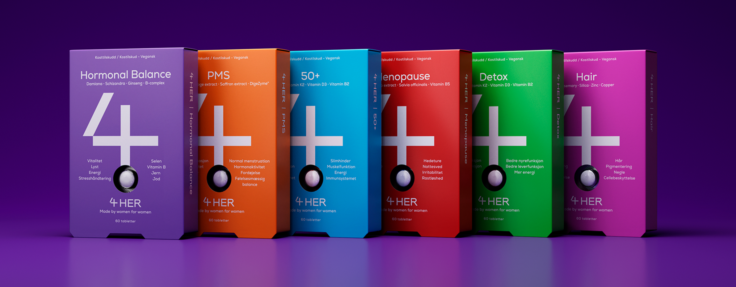
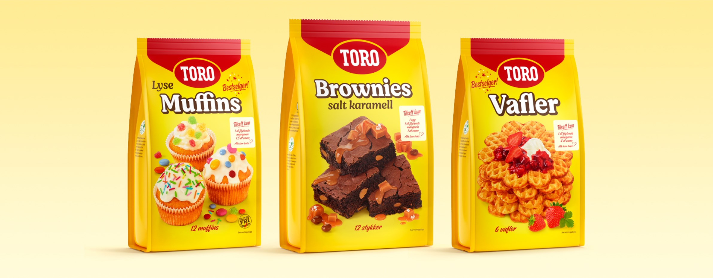
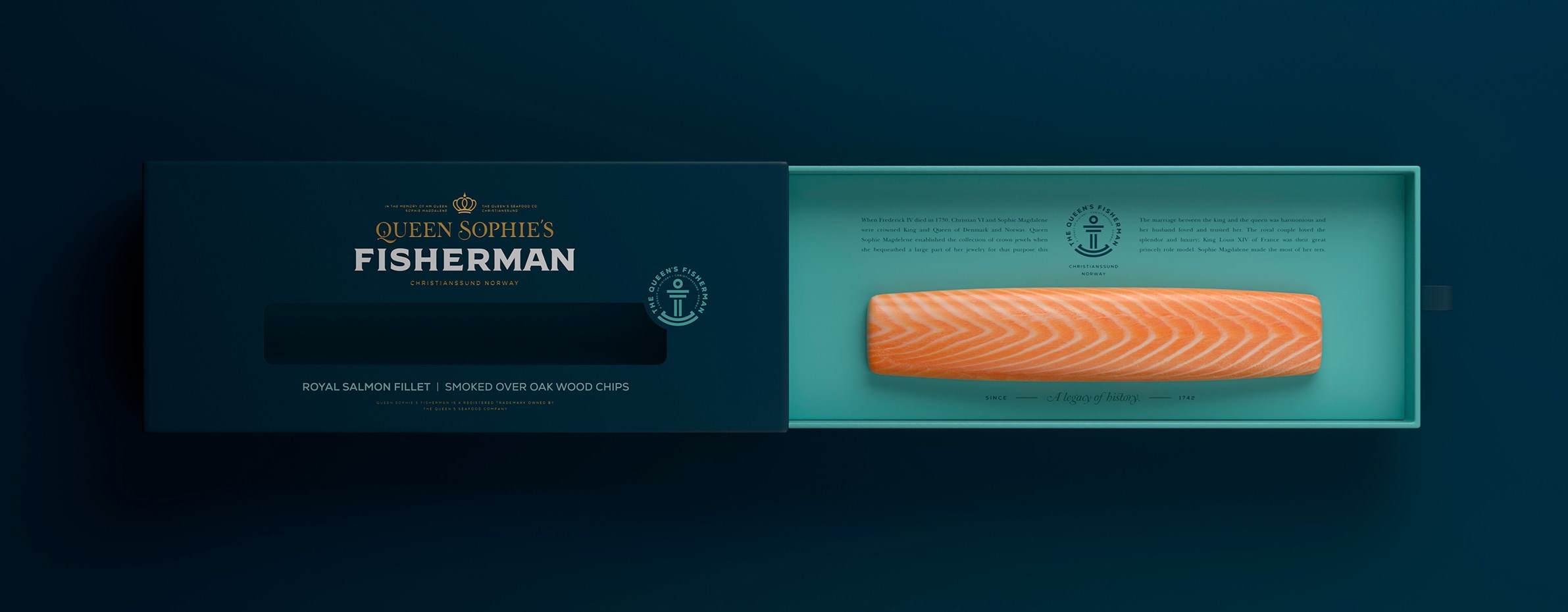
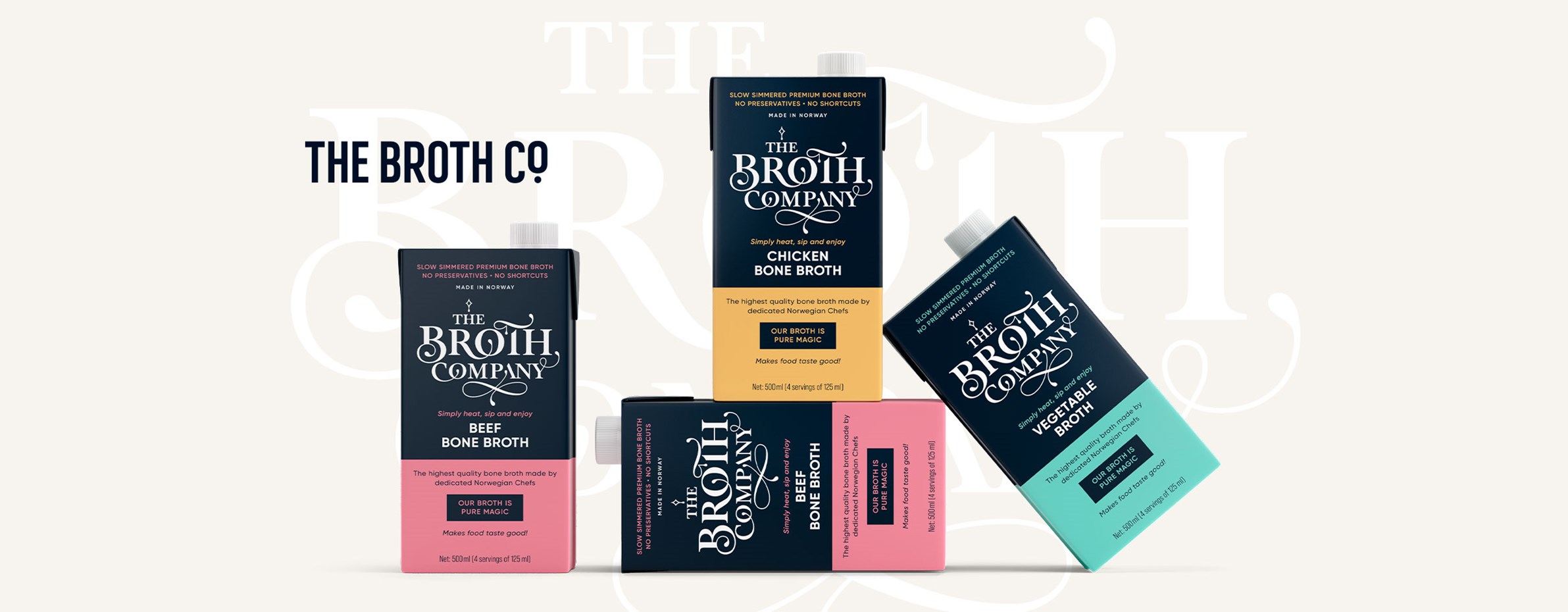
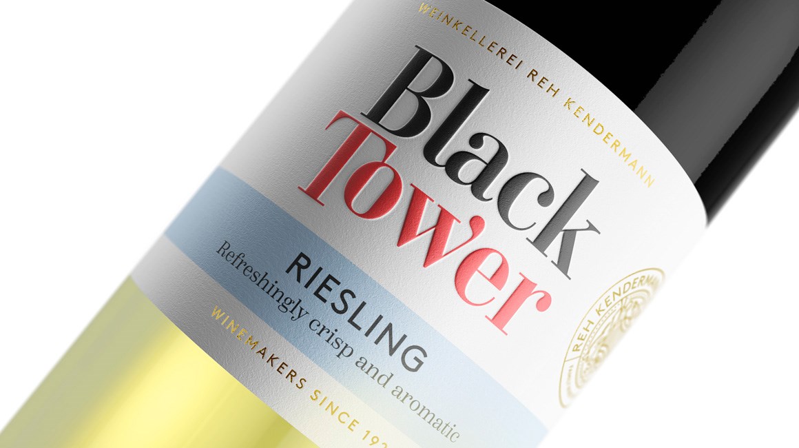
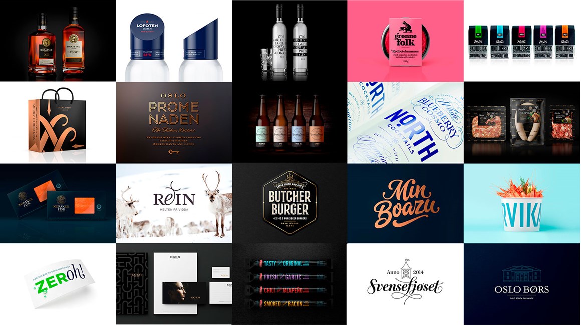
Strømme Throndsen Design er Norges mest prisvinnende designbyrå innen pakningsdesign.
Alle merker og produkter har en historie å fortelle. Forteller du den mest overbevisende versjonen?
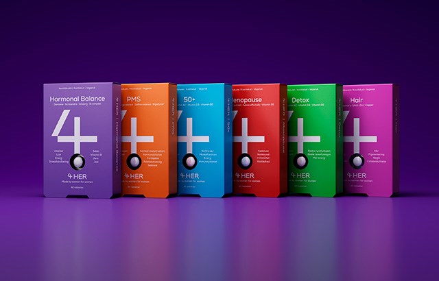
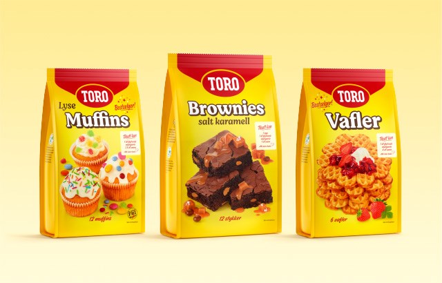
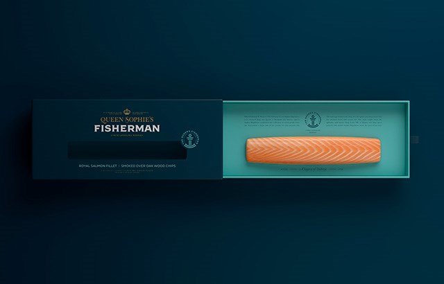
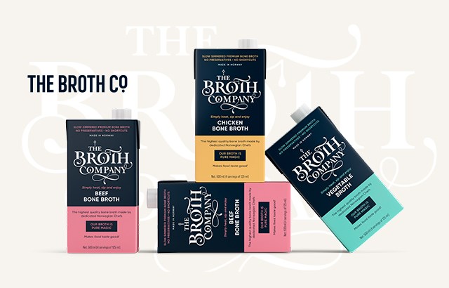
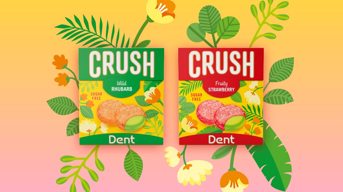
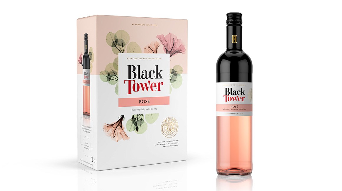
Godt pakningsdesign formidler produktets kvaliteter på en særpreget og interessant måte. Sammen med våre kunder utvikler vi produkter og merkevarer som skaper engasjement og vekker følelser.
Kontakt oss og se mulighetene for ditt produkt.