
Our original design for Lofoten Arctic Water’s bottled water quickly gained recognition within the international restaurant segment and we were hired to design their assortment expansions.
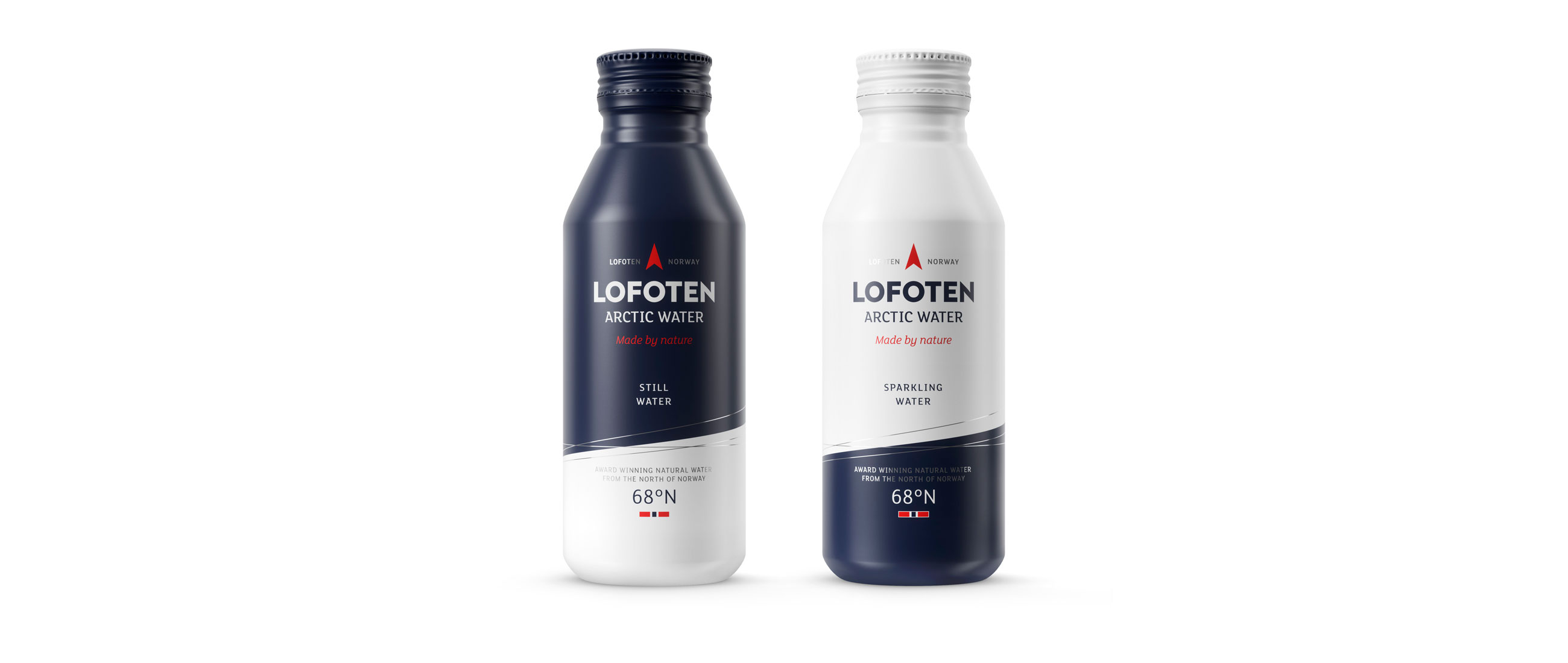
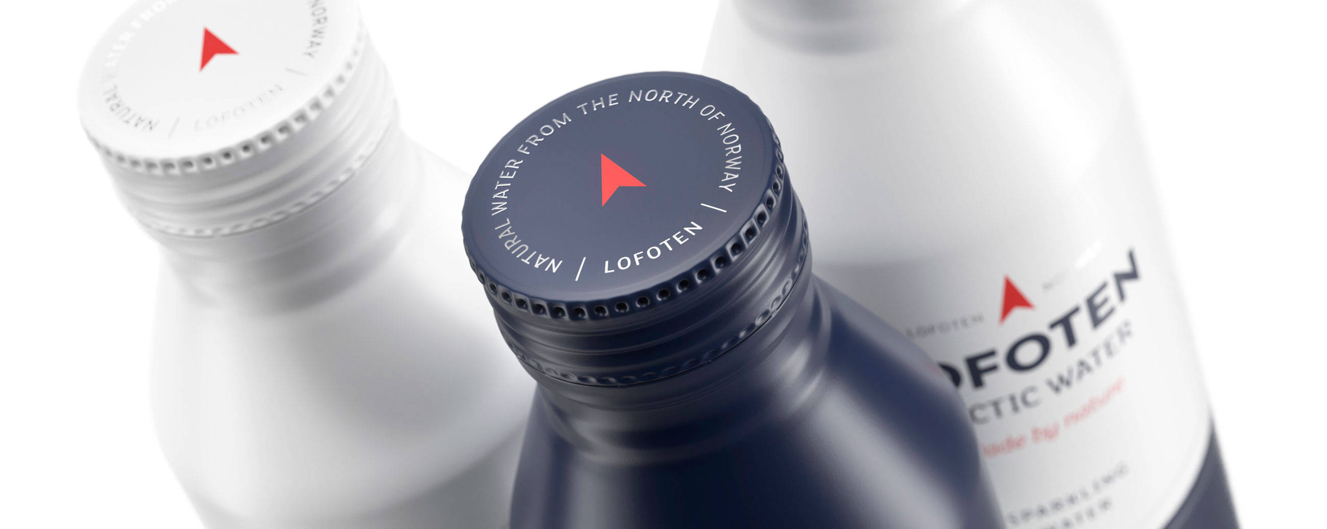
To meet new markets and the cost level of grocery stores we took a significant step towards sustainable packaging by replacing the heavy glass bottle and large plastic cap with smaller sized, aluminium bottled sparkling and still water. We avoid the use of plastic and at the same time the light-weight, recyclable aluminium makes the shipping from the northern-most part of Norway both more cost efficient and environmentally friendly.
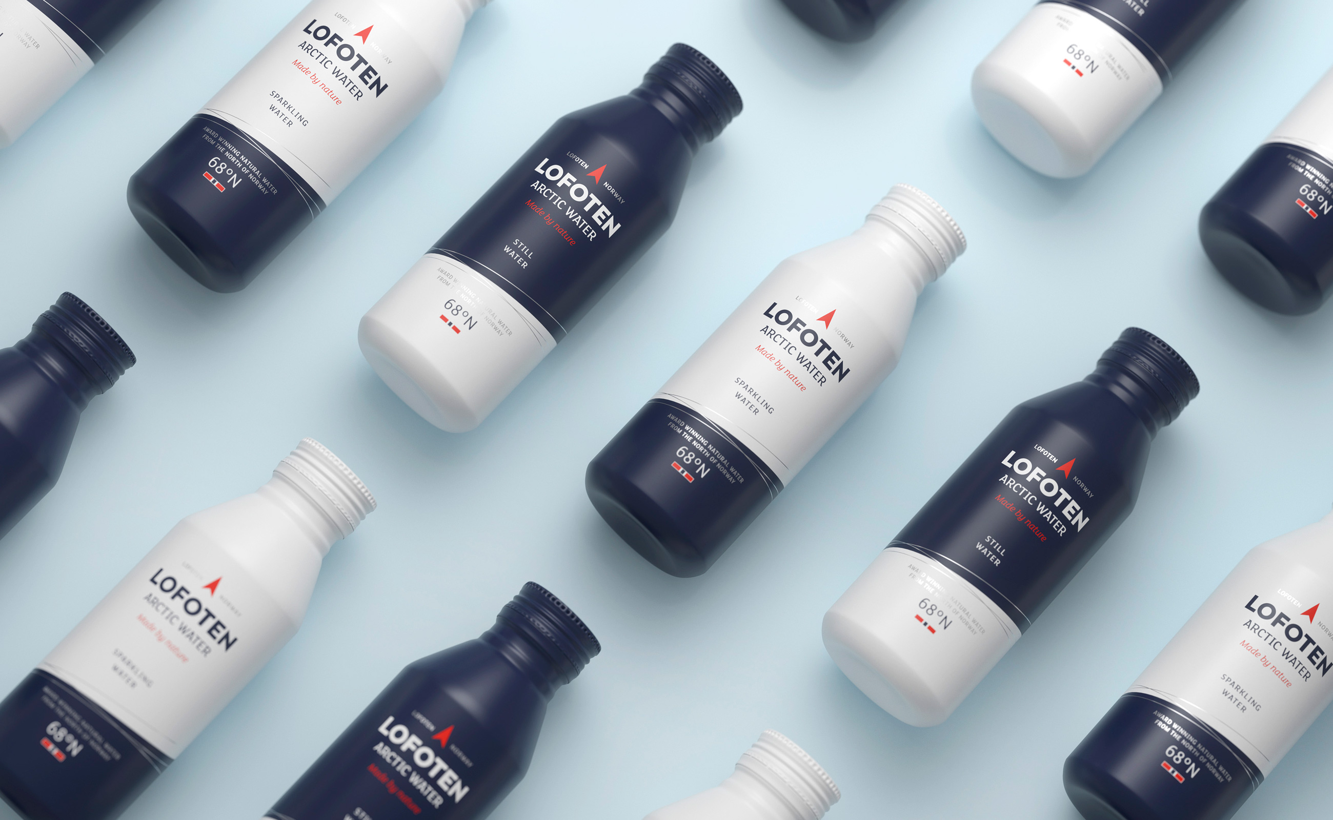
The clear message of a natural and pure product is maintained in a modern and simplistic expression that conveys the product’s high quality. Inspired by the arctic light contrasting with dark blue water, we introduced the slanted, clean panels that bring a reference to Lofoten’s iconic mountains rising from the water. By mirroring the panels in opposite order, we differentiate still from sparkling water.

LOGOTYPE – HAND DRAWN TYPOGRAPHY