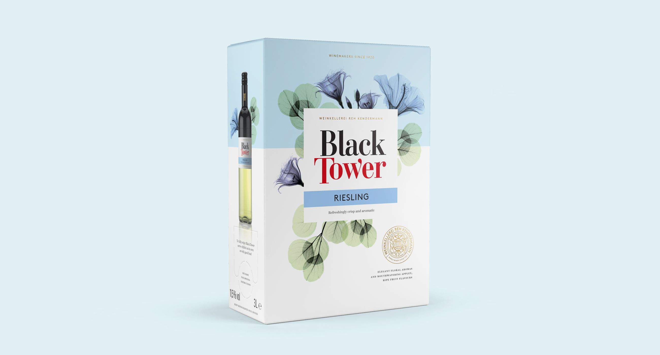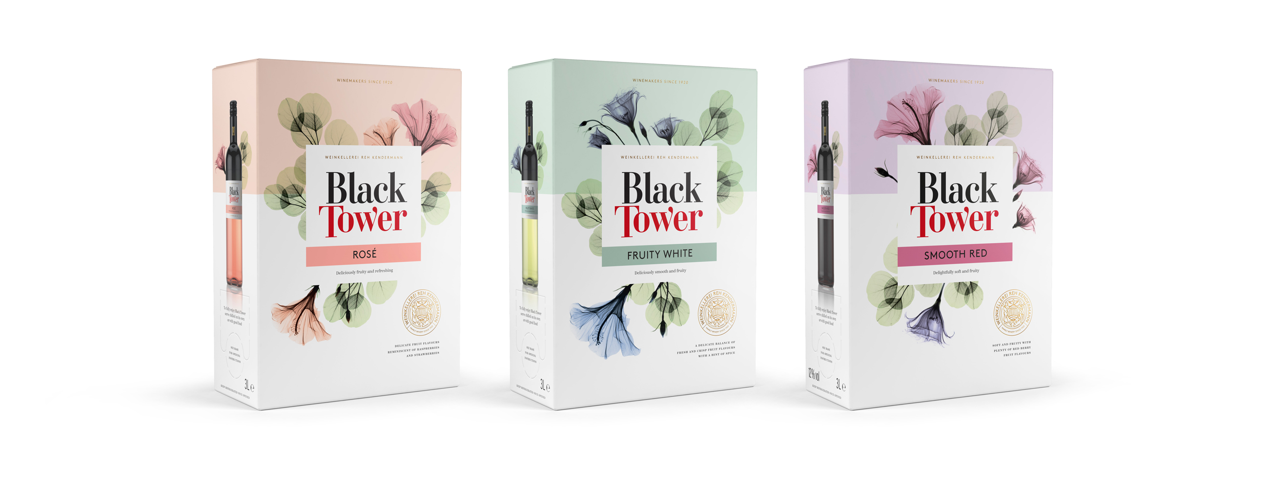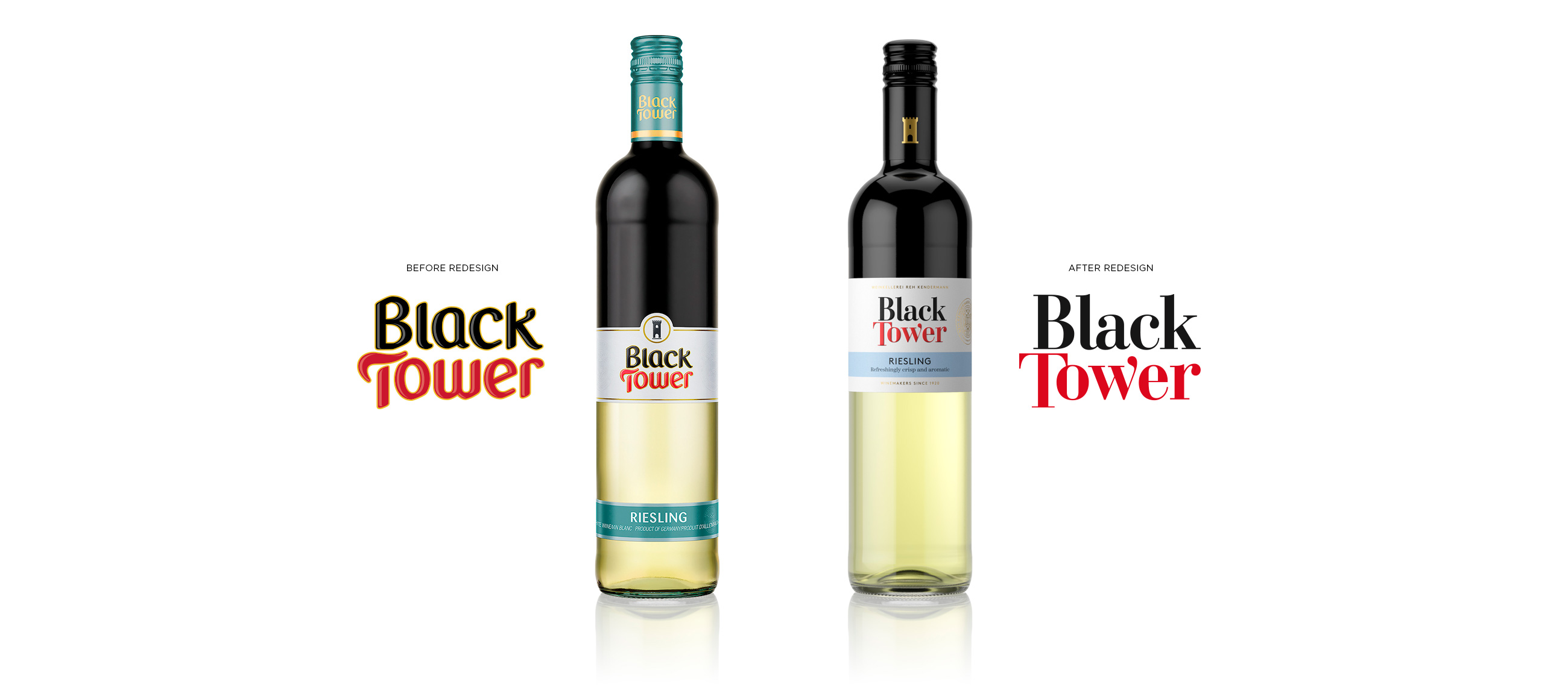
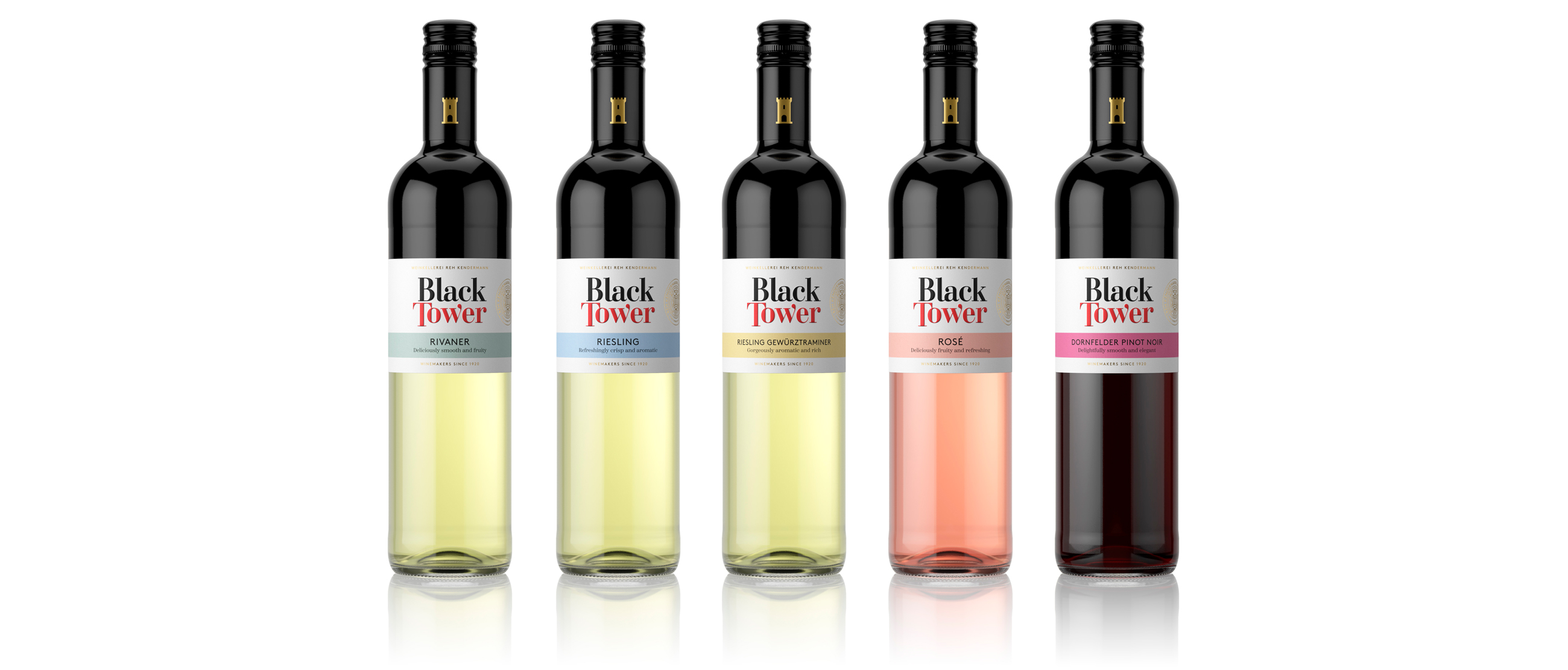
Black Tower is the largest export wine brand from Germany. Their contemporary, accessible wines are sold in more than 35 countries. A decade after their last redesign, Black Tower contacted us for a strategic approach to a revitalisation of both brand and packaging design to reach a new generation of young consumers across all regions worldwide — while staying relevant to their established audience.

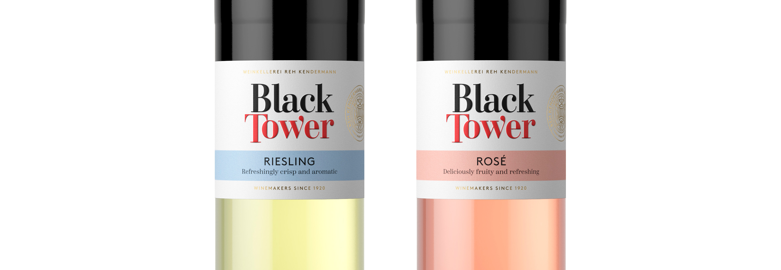
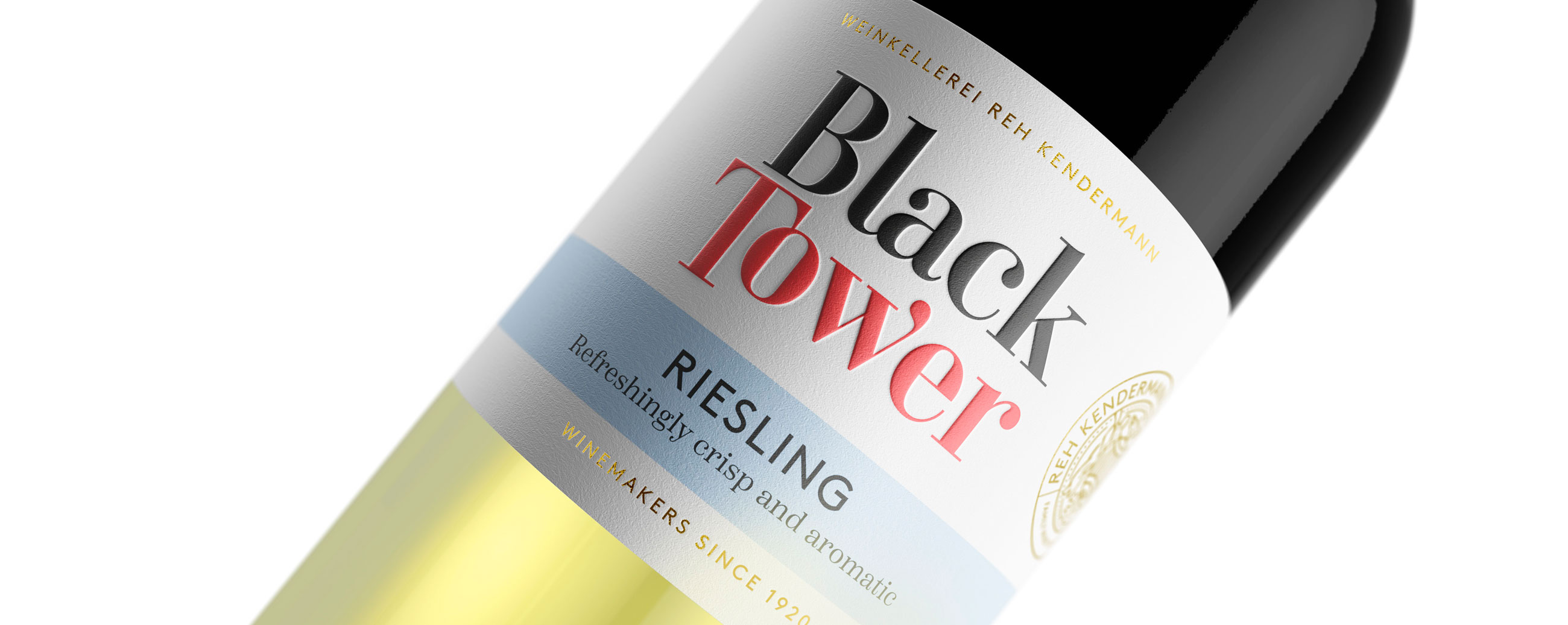
LOGOTYPE – HAND DRAWN TYPOGRAPHY
To capture the hearts and tastebuds of the next generation, we updated the way we tell their story. The mission of our redesign is for Black Tower to be known around the world as the preferred ‘go-to brand’ with easily accessible and drinkable wines that consistently impress with their quality and value.
Black Tower: it’s drinkable, accessible, and most of all it’s easy to love.